Website Accessibility for MCAChicago.org
Project Description
PAC worked with the Museum of Contemporary Art Chicago and Tomas Celizna Studio from the very beginning of the website redesign process to ensure accessibility was in mind long before the coding began. We worked with MCA Chicago, training their staff and developers on best practices in accessible design and coding, so that they were prepared for their full WCAG 2.0 Evaluation performed by the PAC team. A big part of creating an accessible MCAChicago.org included the development of the Coyote Project to describe the thousands of images on the MCA website.
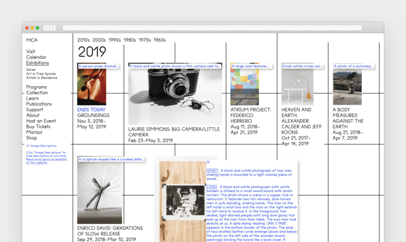
Our work with the MCA continued well after the website's launch to support their team in developing solutions to issues raised in the evaluation, as well as to continue developing Coyote. Initially, image descriptions were available only to people equipped with screen readers. However, the popularity of these image descriptions encouraged us to work with the MCA to develop a means for sighted user to access descriptions as well. As of January 2018, website visitors are able to turn on the visual description layer to read many of the images on the website.
Project Images
-

A screenshot of the visual description layer of MCAChicago.org activated. -

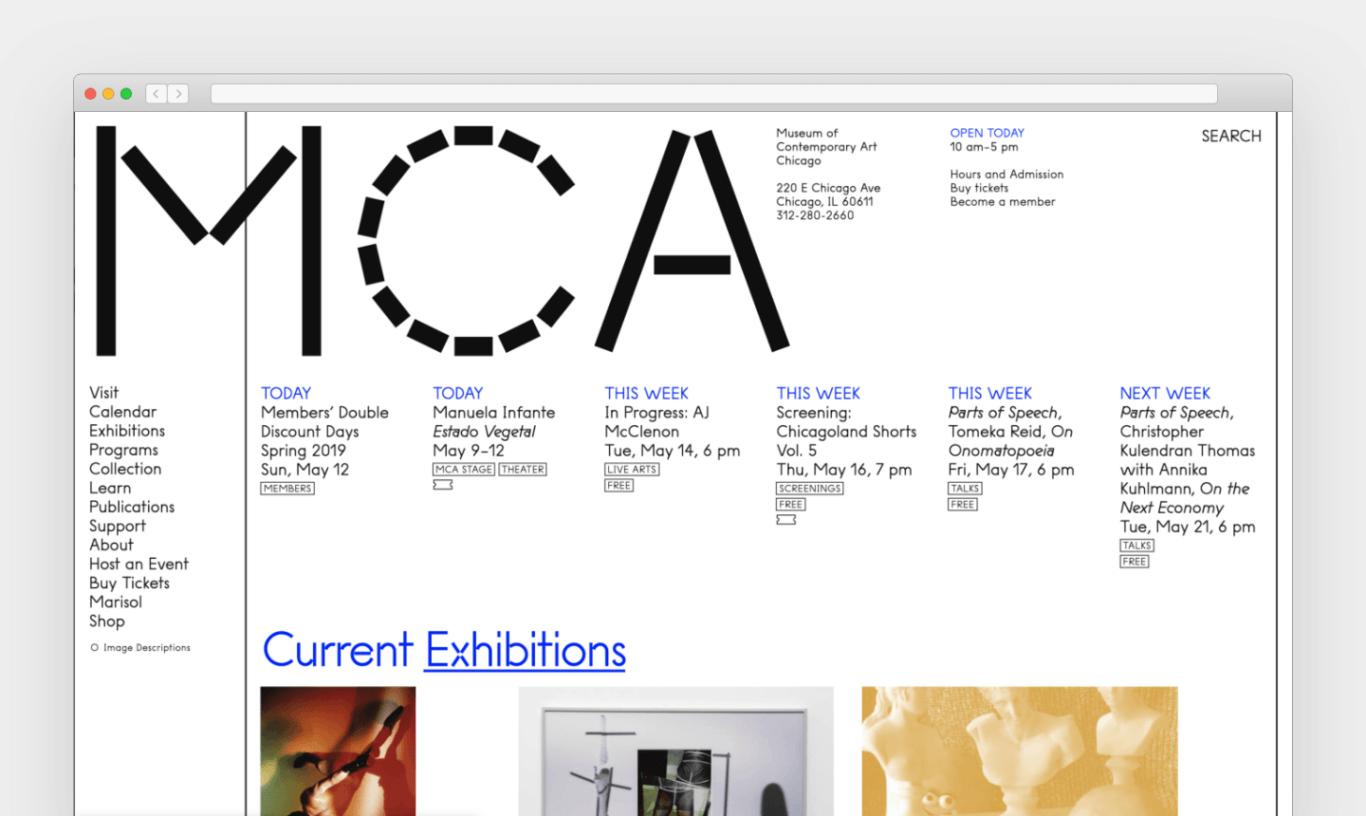
A screenshot of the MCAChicago.org homepage.
