
Projects
We are fortunate to be working on a number of projects globally; from large capital builds to small incubator projects and from rich multisensory experience design to enterprise architecture and capacity building. No matter the type of the project, our inclusive design methodology is applied as we endeavor to welcome the widest possible audience in an inclusive and operationally sustainable manner.
Museum of the Blind People’s Movement
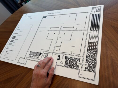
PAC is leading planning, design, and delivery for the National Federation of the Blind’s Museum of the Blind People’s Movement, creating an inclusive, multimodal museum framework that centers blind-led history, advocacy, and visitor experience from pre-planning through schematic design.
Re-imagined The Fisher Collection at 10
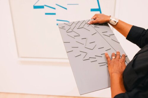
PAC worked with the San Francisco Museum of Modern Art on Reimagined The Fisher Collection at 10, creating an integrated access system with tactile wayfinding, descriptions for every artwork, captions and transcripts for all media, and an accessible exhibition microsite.
Wayfinding
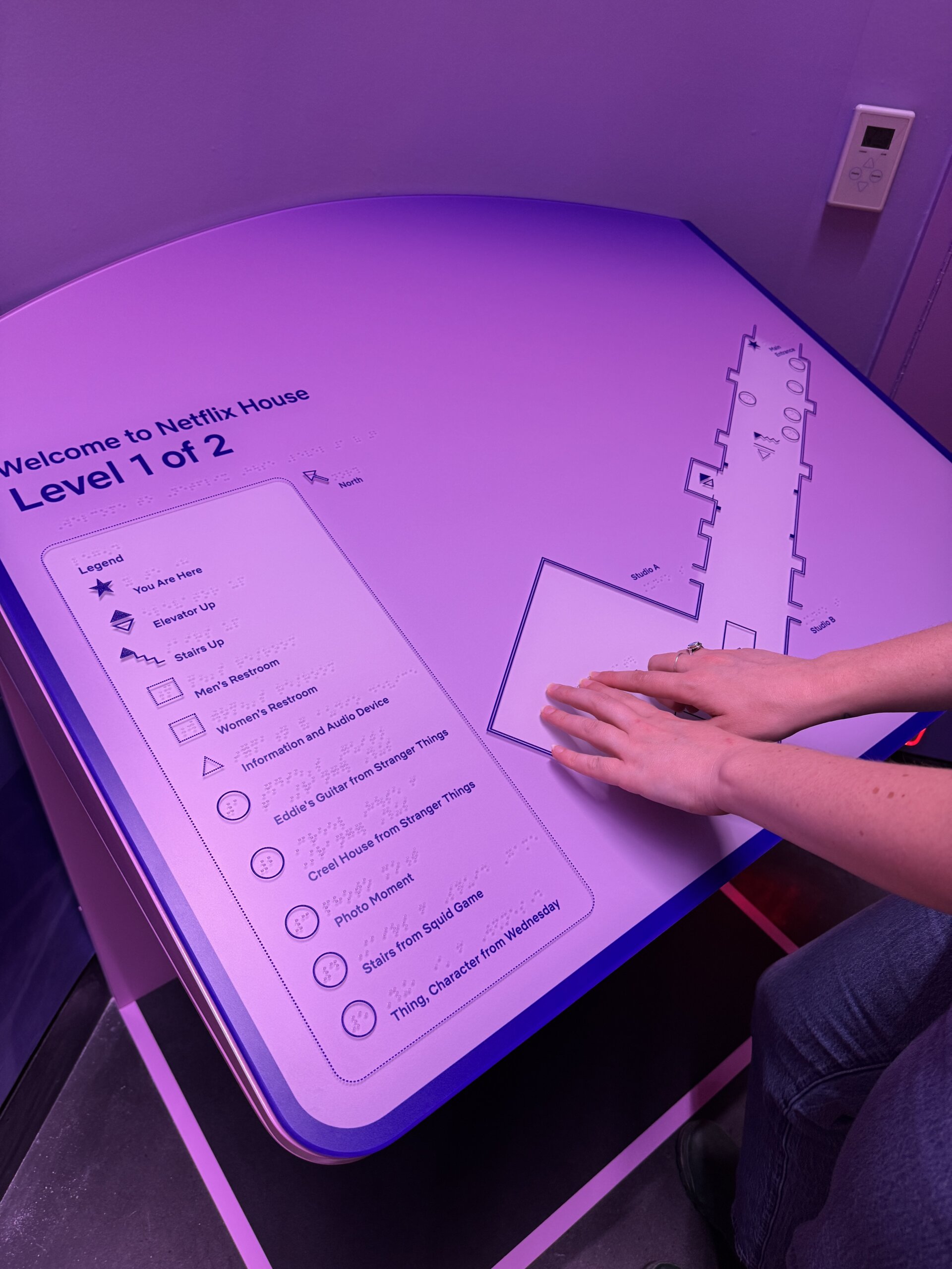
For Netflix House, PAC developed an immersive multimodal wayfinding and content delivery system combining tactile maps, custom floor markers, Braille and high-contrast graphics, and audio navigation to support independent orientation for blind and low-vision visitors while aligning with Netflix’s bold themed environments.
Mosaic Convening Branding
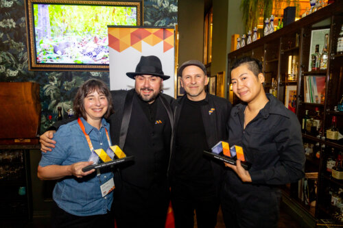
PAC developed Mosaic’s award-winning multimodal brand identity for its inaugural convening, creating interconnected visual, tactile, motion, sound, print, and live event applications that centered inclusion structurally.
Sign Language Labels
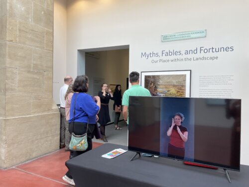
PAC worked with Boise Art Museum to develop Deaf-centered ASL label videos, welcome materials, staff training, and sustainable production workflows shaped by a Deaf Access Working Group, establishing ASL as an integrated part of the museum’s exhibition interpretation.
Transforming Grief Loss and Togetherness in COVID-19 Exhibition
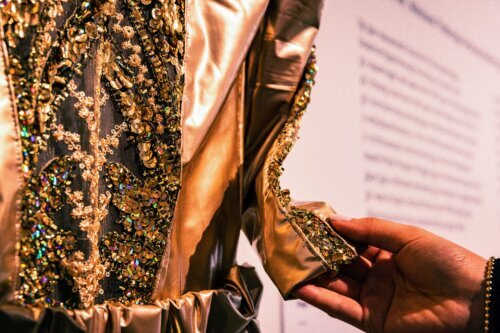
PAC collaborated with the City of Toronto and curators Armando Perla and Raven Spiratos to design, produce, and launch Transforming Grief: Loss and Togetherness in COVID-19, a community-developed, co-curated, multimodal, tri-lingual exhibition integrating inclusive physical and digital access.
Web Accessibility for TNEW Ticketing Interface
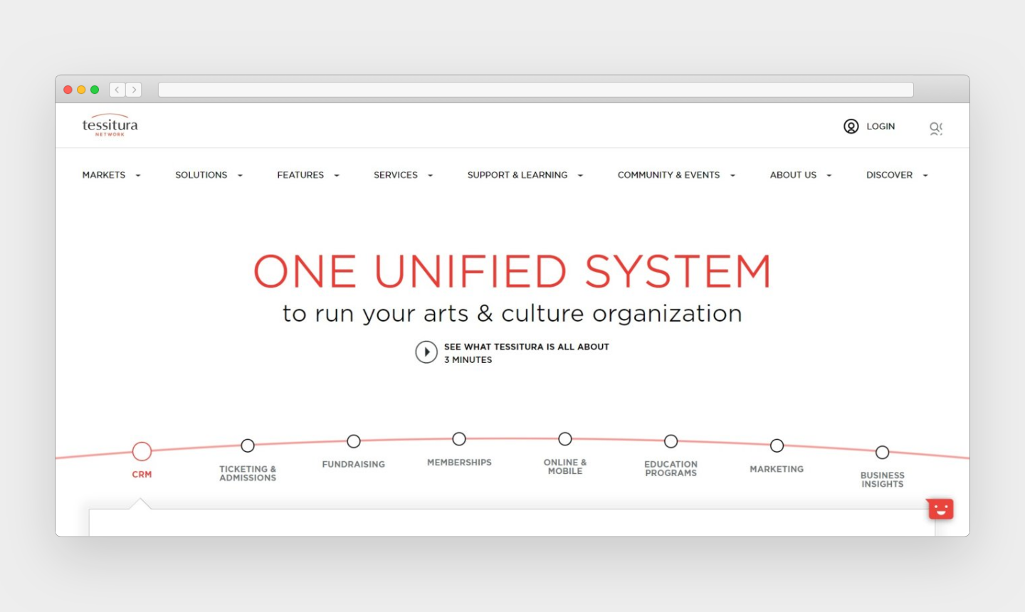
PAC worked with Tessitura on TNEW Version 7, advising on accessibility strategy, interaction patterns, and implementation to create a more accessible, customizable purchasing and transaction experience for museums, performing arts organizations, and cultural institutions using the platform.
Mandela
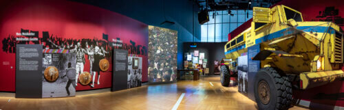
For the Canadian Museum for Human Rights, PAC Principal Corey Timpson directed and produced Mandela: Struggle for Freedom, a bilingual touring exhibition with immersive, interactive, and fully accessible media exploring Nelson Mandela’s life, the anti-Apartheid movement, and his legacy.
Tactile Reproductions and Mobile Application
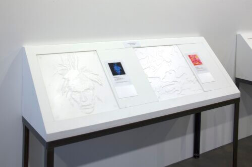
PAC worked with The Andy Warhol Museum on tactile reproductions and the accessible Out Loud mobile app, consulting on durable replica prototypes, writing and recording visual and guided tactile descriptions, and improving app accessibility for blind and low vision visitors.
Empowering Women
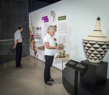
PAC worked with the Canadian Museum for Human Rights to expand Empowering Women into a multimodal, accessible exhibition experience featuring tactile objects, multilingual description, and a user-tested virtual reality component extending its stories beyond the museum.
Capital Project
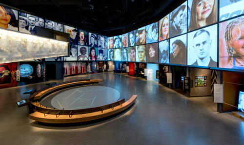
At the Canadian Museum for Human Rights, the Capital Project established a foundational precedent for PAC’s inclusive design practice, embedding accessibility across exhibitions, architecture, digital platforms, the Universal Keypad, Universal Access Point, and Enterprise Content Management System to create a coherent, accessible museum experience.
Orion TI-84 Plus Talking Graphing Calculator
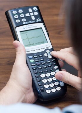
PAC helped the American Printing House for the Blind advance the Orion TI-84 Plus Talking Graphing Calculator by testing its accessible calculator experience and advising on graph sonification, speech translation of calculator interfaces, and haptic support for exploring graphs and datasets.
Accessibility Office Hours

PAC holds recurring Accessibility Office Hours with Slack, helping internal teams design and implement accessible features from the start, prevent regressions, and build company-wide accessibility knowledge through sustained, collaborative guidance.
Digital Accessibility
PAC partnered with Clarivate to build a scalable digital accessibility program, combining office hours, accessibility reviews, and targeted trainings to help product teams improve accessibility, document progress through VPAT/ACR work, and strengthen inclusive design and development practices across the organization.
CODAP Accessibility Discovery Report
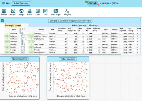
PAC worked with the Concord Consortium to produce the CODAP Accessibility Discovery Report, an in-depth review of CODAP v3 Beta and support documentation with a prioritized roadmap for improving accessibility across the learner journey.
ArtLens
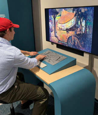
PAC partnered with the Cleveland Museum of Art, Design I/O, Dome Collective, and Line Break on ArtLens Reimagined, the third iteration of the museum’s ArtLens gallery, leading inclusive experience design, tactile design, and the digital accessibility of the companion ArtLens app so the reimagined gallery is accessible by design rather than by afterthought.
Obama Presidential Center
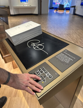
PAC worked with the Barack Obama Foundation on the Obama Presidential Center to embed inclusive design and accessibility across the museum, media, digital systems, and visitor journey, including development of the Universal Experience Point as a shared access layer for complex cultural experiences.
Power On! Audiobook
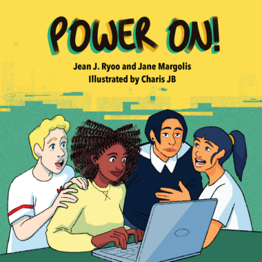
PAC produced its first audiobook: an accessible adaptation of Power On! by UCLA researchers Jean J. Ryoo and Jane Margolis, uniting authentic casting, integrated visual description, and carefully balanced sound design to bring the graphic novel’s technology-justice story to listeners.
Capitol Project
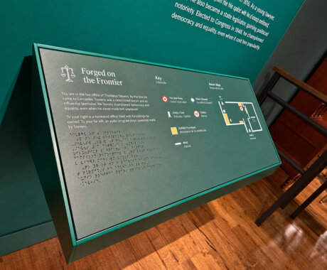
PAC partnered with Lancaster History, Ralph Appelbaum Associates, and Civic Architects on the Thaddeus Stevens and Lydia Hamilton Smith Center for History and Democracy, leading inclusive design and accessibility from concept design through construction across a site that mixed new construction with a historic building not easily made accessible after the fact.
Screen Reader Trainings
PAC delivered a three-part Screen Reader Trainings series for Clarivate, building staff understanding of screen readers as primary interfaces and translating demonstrations of JAWS, NVDA, and VoiceOver into practical insight for designing, developing, and evaluating more accessible digital experiences.
Verbosity Settings
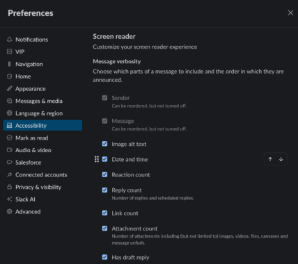
PAC supported Slack in designing, testing, and refining screen reader verbosity settings across desktop, mobile, and web apps, enabling users to reorder or disable message details for more efficient, customizable navigation.
The Coyote Project
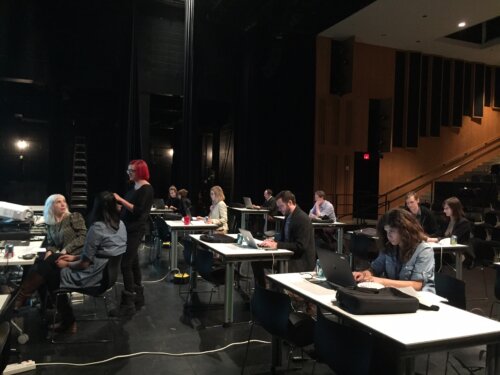
PAC partnered with MCA Chicago to create The Coyote Project, a visual description workflow and hosted platform that enabled museums and cultural organizations to author, review, approve, and publish image descriptions and alt text across their digital products.
Capacity Building
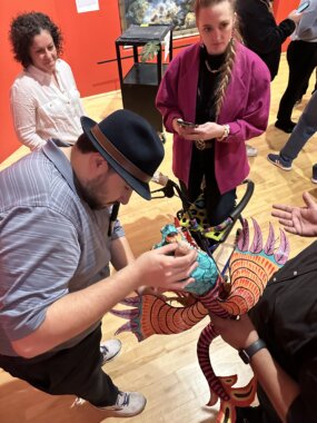
PAC worked with the National Museum of Mexican Art on “Arte for All: Accessibility at NMMA”, a multi-year capacity-building initiative that embedded inclusive design into museum operations through staff training, advisory groups, roadmapping, and sustainable accessibility workflows.
Using AI as a Tool for Visual Descriptions
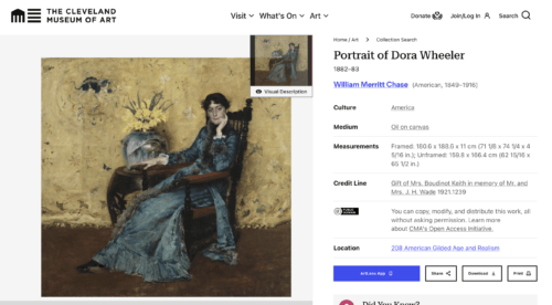
PAC partnered with the Cleveland Museum of Art to train staff, create a Visual Description Style Guide, and responsibly integrate AI with human review and image-level metadata, establishing scalable workflows to deliver short visual descriptions across the museum’s online collection.
Accessibility Discovery Report
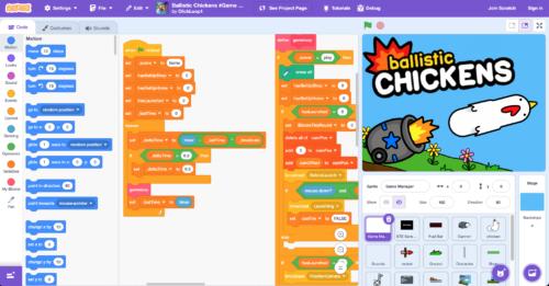
PAC prepared an Accessibility Discovery Report for the Scratch Foundation, reviewing Scratch 3.0’s editor, Blockly infrastructure, and learning resources to identify barriers for disabled learners and deliver a prioritized roadmap for a more accessible creative coding environment.
Simplified Layout Mode
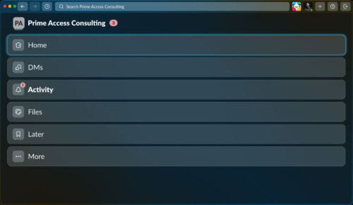
PAC helped Slack design and test Simplified Layout Mode, a desktop and web accessibility feature that reduces visible interface complexity, supports more linear navigation, and preserves core Slack functionality for users who benefit from greater focus, clarity, and access technology compatibility.
Capacity Building
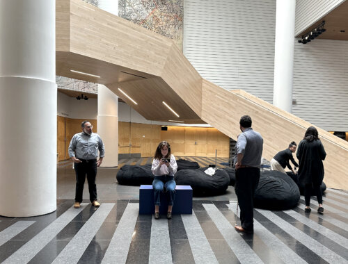
PAC partnered with San Francisco Museum of Modern Art to build institutional capacity for inclusive design through staff workshops, a cross-departmental Roadmap, and coaching, resulting in stronger internal workflows and expanded access practices across exhibitions, digital media, touch objects, seating, and sensory spaces.
Capacity Building
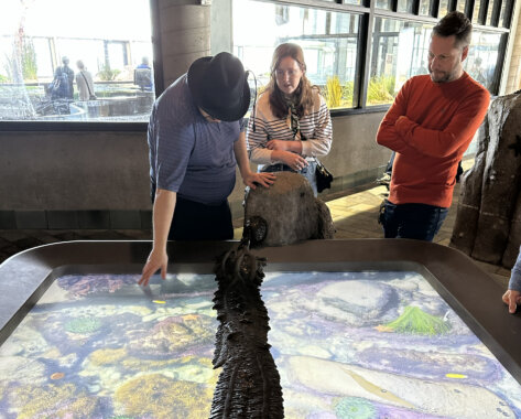
PAC helped Monterey Bay Aquarium build inclusive design capacity through workshops, a five-year Inclusive Design Roadmap, physical prototyping, and theatre accessibility guidance, establishing a practical foundation for embedding access across exhibits, programs, staff tools, and visitor experiences.
Capacity Building and Touch Objects
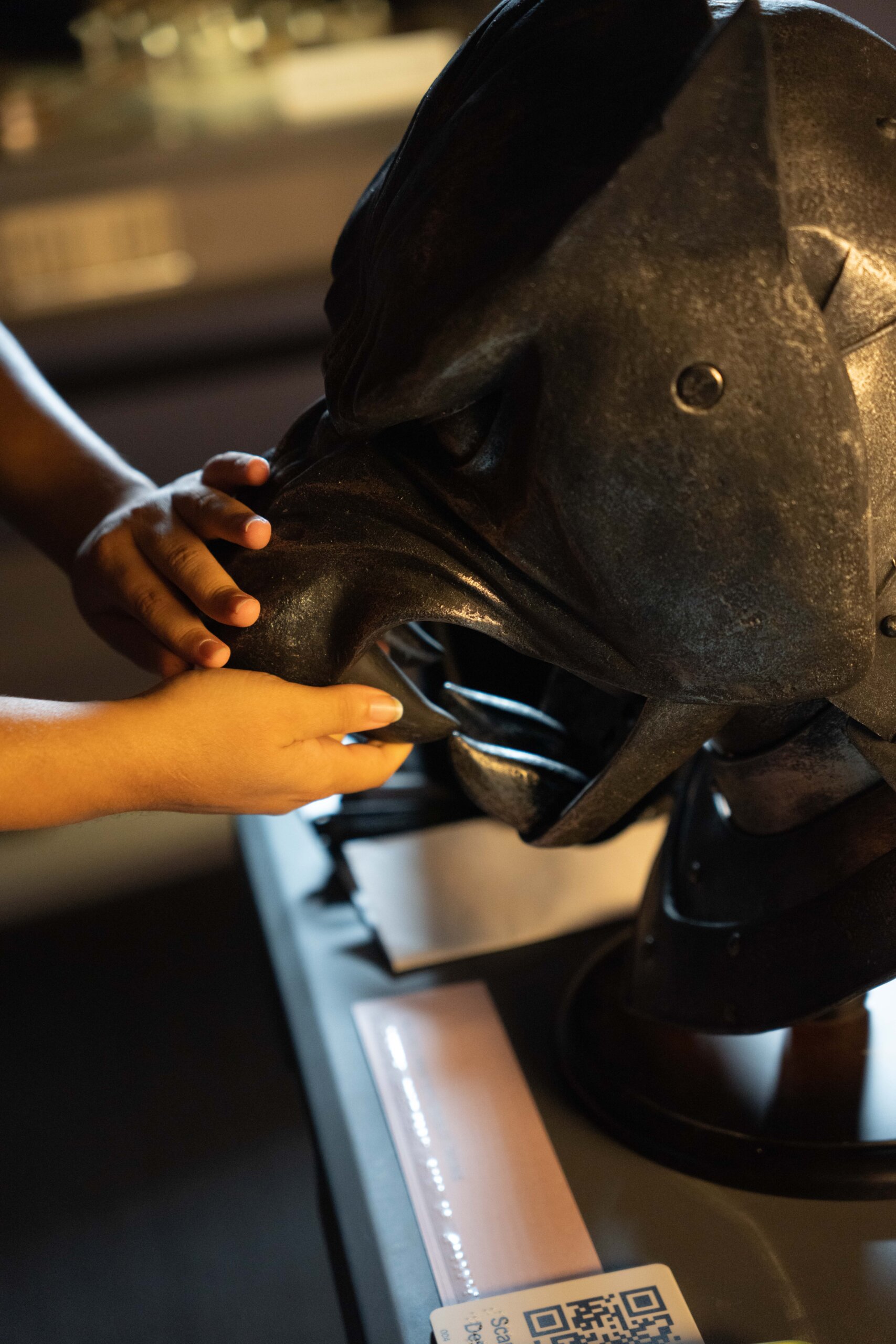
PAC helped Museum of the Moving Image build inclusive design capacity through staff training and a working group, then supported community-led prototyping that produced nine accessible touch objects and a recurring monthly touch experience program.
Experience Programming in Quorum (EPIQ)
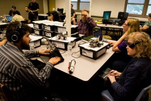
PAC supported Quorum Foundation’s EPIQ from 2010 to 2023 through Sina Bahram’s leadership, instruction, and technology demonstrations, helping educators use the accessible Quorum programming language to expand inclusive computer science learning, including for blind students.
Art In the Park
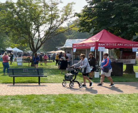
For Boise Art Museum’s Art in the Park, PAC embedded inclusive design across the festival ecosystem—auditing wayfinding, creating an accessible map with a long description, refining parking/drop-off and wheelchair lending, training sighted guides, and onboarding vendors with accessibility guidance—so access became core to planning rather than an add-on.
Many Wests
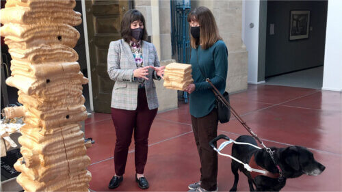
PAC and Boise Art Museum used an IMLS Museums Empowered grant to embed inclusive design into Many Wests: Artists Shape an American Idea—spanning galleries, graphics, and media—with visual descriptions, tactile access, ASL/captions, mobile interpretation, staff training, and an Inclusive Design Advisory Group, producing an accessible exhibition and institutional capacity.
Brand Guidelines Evaluation
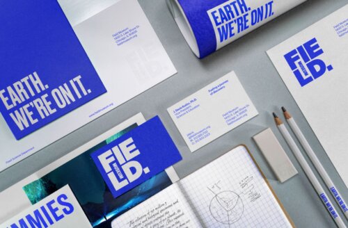
PAC helped the Field Museum and Leo Burnett evaluate the museum’s new brand style guide for inclusive design, recommending color-contrast adjustments and accessibility specifications that expanded the guidelines for readable, usable, and brand-aligned print and digital materials.
UncleGoose: Accessible Blocks-Based Programming
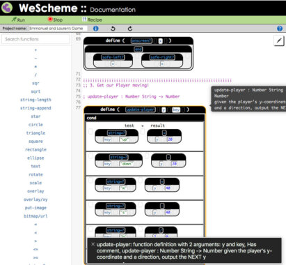
PAC collaborated with Bootstrap to improve the accessibility of CodeMirror-Blocks, producing a language-agnostic CodeMirror wrapper that lets blind and low-vision students navigate, edit, and understand code through tree-based structure and natural-language descriptions alongside their peers.
Website Accessibility for FieldMuseum.org
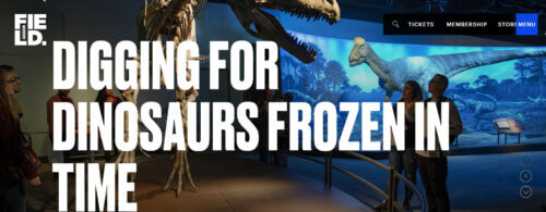
PAC helped the Field Museum integrate accessibility into FieldMuseum.org from brand guidelines through design and implementation, advising on legibility, contrast, image-based design patterns, visitor accessibility content, and WCAG A/AA auditing to support a visually expressive, usable, and inclusive website.
PedPal: An App to Make Street Crossings More Inclusive
PAC worked with Carnegie Mellon University to design and build PedPal, an iPhone application that connects with smart traffic signals via DSRC or cellular networks to help disabled pedestrians assess crossing time, request more time where supported, and navigate signalized intersections more safely.
Inclusion Workshop and On-site Training at Ford’s Theatre
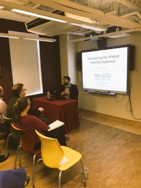
PAC developed and delivered inclusion workshops and on-site training for Ford’s Theatre, equipping staff across web, front-of-house, roadmapping, and visitor-experience roles to make accessibility a more confident, practical, and ongoing part of the institution’s culture.
Math Support Finder with the DIAGRAM Center
PAC worked with Benetech’s DIAGRAM Center initiative to design and develop Math Support Finder, a searchable tool that helps students, educators, families, publishers, and accessibility professionals identify how digital mathematics can be accessed across platforms, technologies, formats, and accessibility features.
A Scavenger Hunt Powered by Coyote
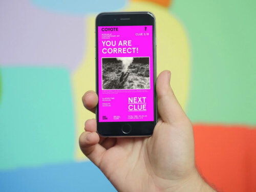
With support from the Knight Foundation, PAC collaborated with MCA Chicago on A Scavenger Hunt Powered by Coyote, improving the hosted open-source Coyote platform and creating a public web-based game that used image descriptions as playful interpretive clues.
Exploring the Gallery through Voice
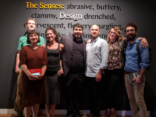
PAC worked with Cooper Hewitt and Alley Interactive to shape the interpretive and accessibility strategy for an Alexa skill that let remote visitors experience *Tablescapes* through object information and detailed visual descriptions.
Inclusive Design Policy
PAC helped the Canadian Museum for Human Rights craft an Inclusive Design Policy that formalized accessibility requirements across websites, internal systems, exhibition technologies, and visitor-facing digital experiences within the museum’s governance structure.
Accessible Labels App for “The Senses” Exhibition
PAC collaborated with Cooper Hewitt, Smithsonian Design Museum to create an accessible mobile and web label system for The Senses: Design Beyond Vision, connecting concise braille gallery labels to expanded text, zoomable images, visual descriptions, and human-read audio.
Math Share with the Diagram Center
PAC consulted with Benetech’s DIAGRAM Center initiative on Math Share, helping shape and test an accessible web application for students to solve math problems, show and revise their work, and submit it in formats teachers, including blind users, could review.
Image Share with the DIAGRAM Center
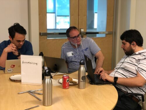
PAC worked with Benetech’s DIAGRAM Center to conceptualize and build Image Share, a fully accessible web application that helps educators, students, families, and accessibility professionals discover, evaluate, and reuse accessible STEM learning materials more efficiently.
Inclusively Designed Mobile Application
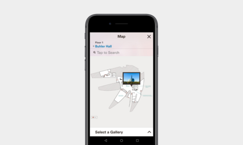
PAC supported the Canadian Museum for Human Rights in shaping and validating an inclusively designed mobile application that extends the museum’s Universal Access Point strategy, connecting gallery interfaces, beacon-based location content, and accessible exhibition media in English and French.
Website Accessibility for MCAChicago.org
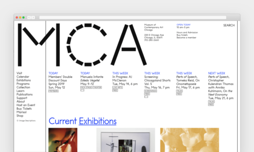
PAC worked with MCA Chicago and Tomas Celizna Studio on MCAChicago.org’s redesign, providing accessibility training, design and development support, a WCAG 2.0 evaluation, and the Coyote Project workflow that enabled visual descriptions for thousands of images and a public description layer.
Sight Unseen
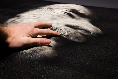
PAC partnered with the Canadian Museum for Human Rights to design Sight Unseen, a multimodal photography exhibition by blind photographers, integrating tactile wayfinding, 3DPhotoworks sculpted reliefs with touch-activated audio, and participatory nonvisual photo-taking and swell-form tactile drawing activities that democratized content and made accessibility the creative driver.
Math Player 4: Accessible Math on the Web
PAC worked with Design Science on MathPlayer 4 to help define structural navigation, spoken math, and braille math interactions that enabled screen reader users to explore and understand web-based mathematical expressions more effectively.