Brand Guidelines Evaluation for the Field Museum

Client: Field Museum

Project Description

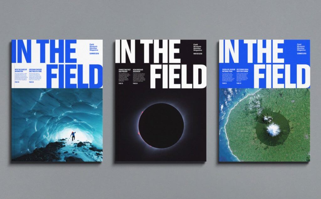
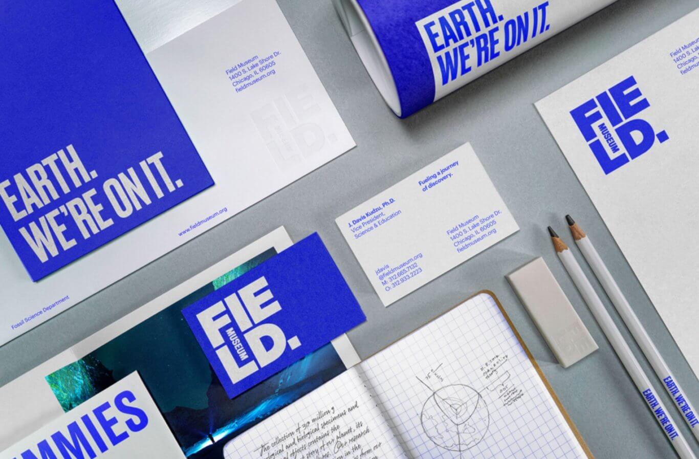
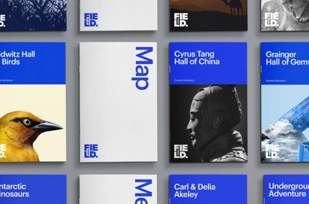
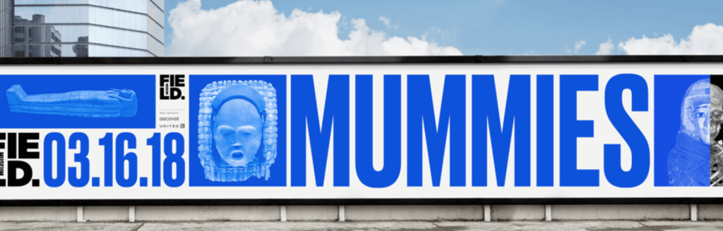
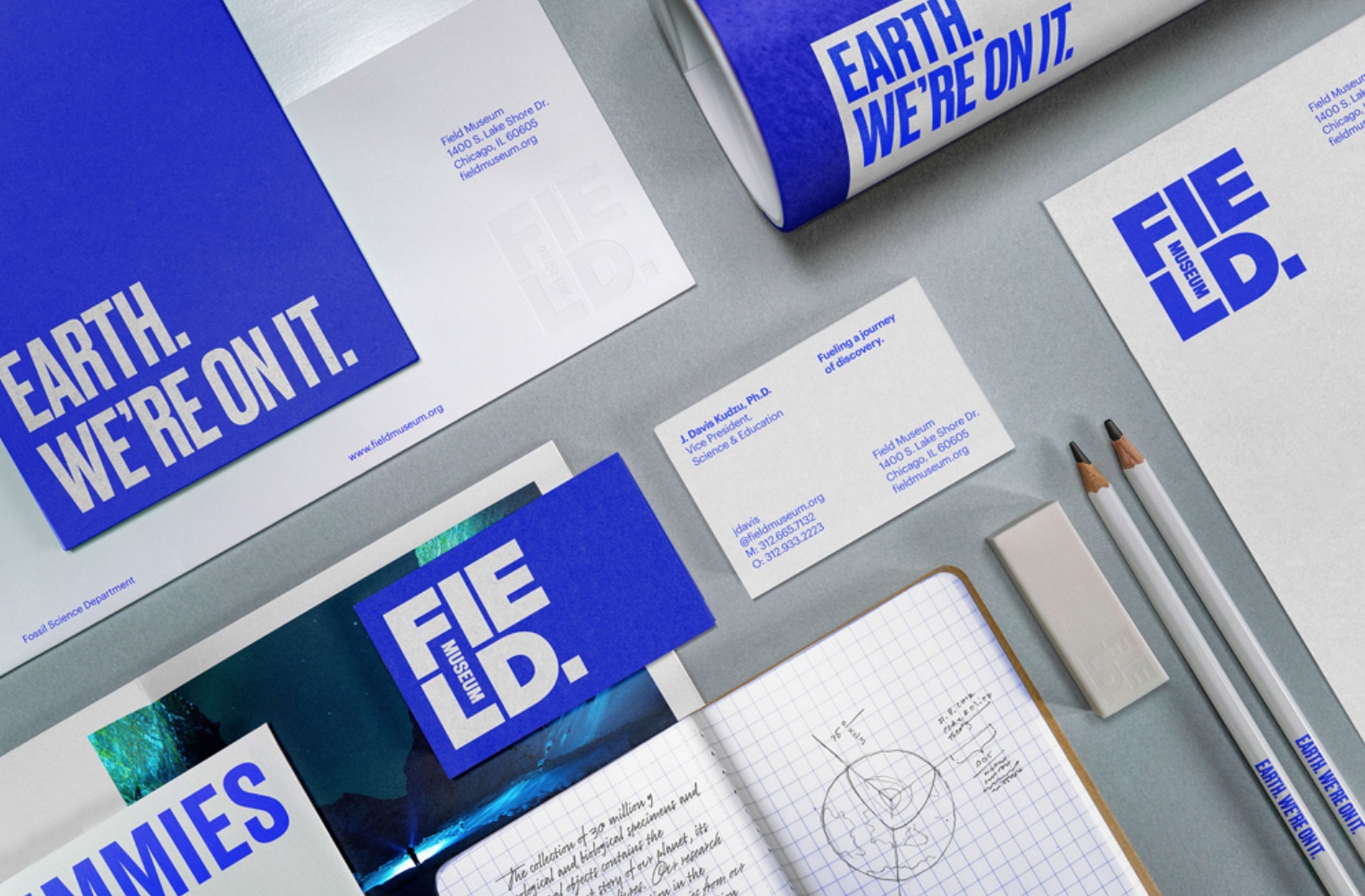
When launching its new visual brand identity the Field Museum engaged PAC to review the brand style guide through the lens of inclusive design. PAC worked with Leo Burnett, the museum's agency, to adjust the initially proposed colors to improve contrast, and identify colors that can and cannot be used together when designing materials. Furthermore, based on PAC’s recommendations for the overall style guide, the Field team developed additional sections for the guide on accessibility specifications of the brand for print applications to ensure legibility while also embodying the museum's new visual aesthetic.

Project Images

  • Three books are displayed in a horizontal row, each with the large title "In the Field" and a featured image, including a person in a cave, a solar eclipse, and an abstract image that could be an aerial view.
  • Bright blue and white Field Museum–branded business cards, notecards, pencils, and letterhead are neatly laid out on top of a grey surface.
  • The Field Museum's logo is duplicated multiple times in white to cover the front side of a brown paper shopping bag.
  • A large sign lists exhibits in white text on black on the left side, corresponding floor numbers in blue and gray in the middle, followed by black arrows on white indicating which way to go.
  • Vertical booklets are neatly laid out in a perfect grid. They are labeled with the names of exhibit halls and exhibitions as well as "Map" in large blue and white text.
  • A Field Museum billboard rendered almost entirely in blue with the a large text reading "MUMMIES" accompanied by images of a skeleton, sarcophagi, a mask, and exhibition dates.