Website Accessibility for FieldMuseum.org
Project Description
When the Field Museum set out to build a new website, FieldMuseum.org, they wanted it to be as inclusive and accessible to the widest possible audience. They brought PAC on board very early in the design process to consult on their brand guidelines that would be the foundation for their new website.
Because the Field wanted to show what it’s like to visit the museum, the web design relied heavily on imagery. PAC worked with the Field and their agency, Purple Rock Scissors, to enhance inclusion from early on in the design phase. This work involved efforts to maintain visual legibility within required color contrast levels across the site in various ways. For instance, headlines displayed over a semi-transparent layer on top of the image, which increases contrast between the white text and the background image. Furthermore, PAC worked with the Field team to develop an area of the site dedicated to communicating the range of accessible offerings the museum has to offer. PAC also audited FieldMuseum.org to ensure maximum accessibility.
Project Images
-

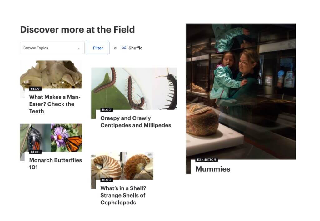
The "discover" feature on FieldMuseum.org -

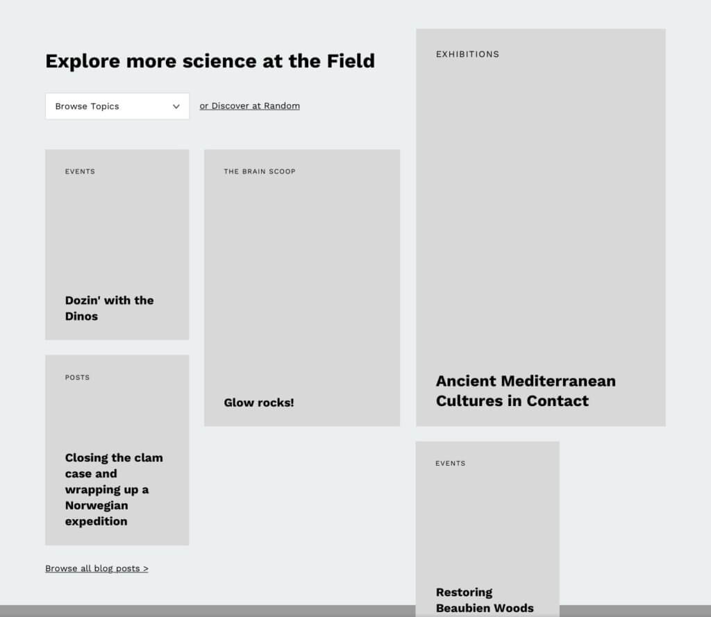
The Field Museum's "discover" wireframes -

The exhibition page for Maximo the Titanosaur on FieldMuseum.org -

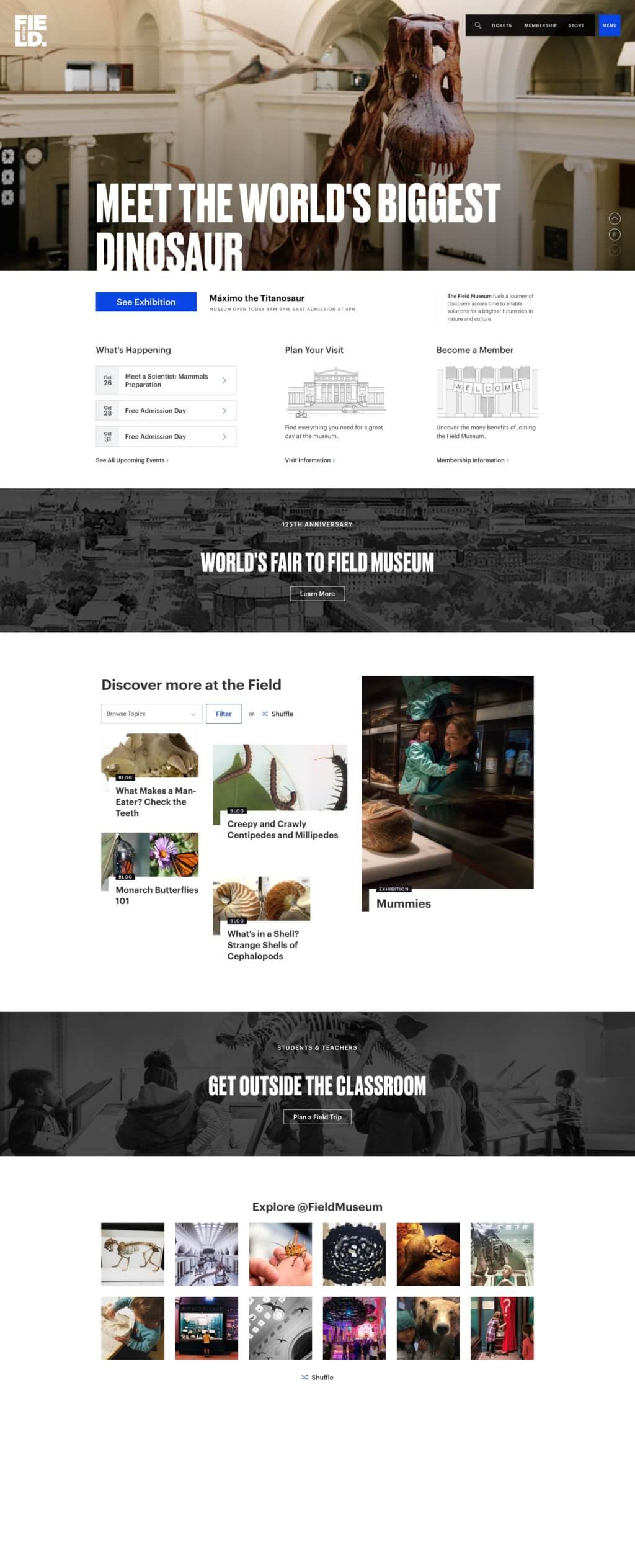
The homepage for FieldMuseum.org -

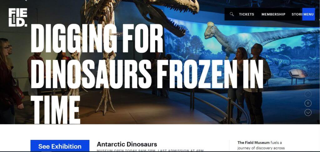
The carousel header of the homepage for FieldMuseum.org
