Wayfinding

For Netflix House, PAC developed an immersive multimodal wayfinding and content delivery system combining tactile maps, custom floor markers, Braille and high-contrast graphics, and audio navigation to support independent orientation for blind and low-vision visitors while aligning with Netflix’s bold themed environments.
Media
Project Description
There is a persistent assumption that accessible design means restrained design: that meeting the needs of disabled visitors requires pulling back on visual ambition, sensory richness, or brand expression. The wayfinding work at Netflix House was an opportunity to challenge that assumption directly. Working within one of the most visually distinctive and culturally recognizable suites of intellectual property in entertainment, Prime Access Consulting helped develop a multimodal wayfinding and content delivery system that is both fully functional as an access tool and fully consistent with the bold, immersive aesthetic Netflix House is built around.
Netflix House is a permanent, year-round entertainment venue that brings Netflix’s most popular shows and films to life through immersive, theme-based environments, specialty dining at Netflix Bites, and exclusive retail. Netflix began piloting these in-person experiences in 2025 with the opening of locations in Philadelphia, Pennsylvania in November and Dallas, Texas in December.
The environments are dense with layered murals, oversized props, sculptural installations, and dramatic lighting that shifts between thematic zones. Prop staircases intersect at impossible angles; murals extend into dimensional forms. The challenge was not simply to make these spaces navigable, but to create independent orientation and navigation within environments driven almost entirely by visual scenography. PAC’s work focused on doing so in a way that treated access as part of the experience rather than apart from it.
Tactile Maps
PAC’s tactile map system draws on icons, symbols, and patterns developed and refined over several years through rigorous prototyping and testing with client projects and community groups. Working closely with the Netflix House team, PAC determined what information needed to be communicated at each decision point and how best to represent it within a tactile format.
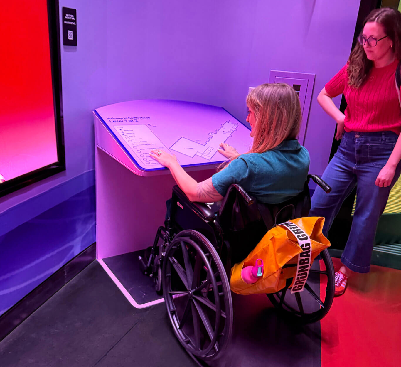
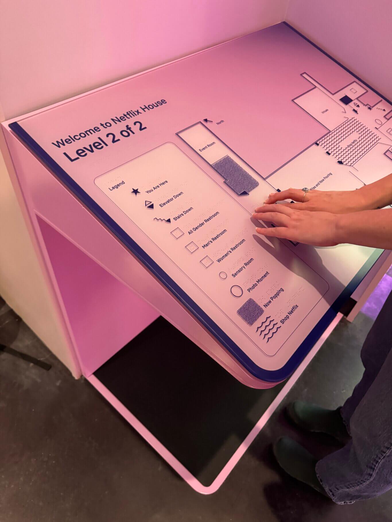
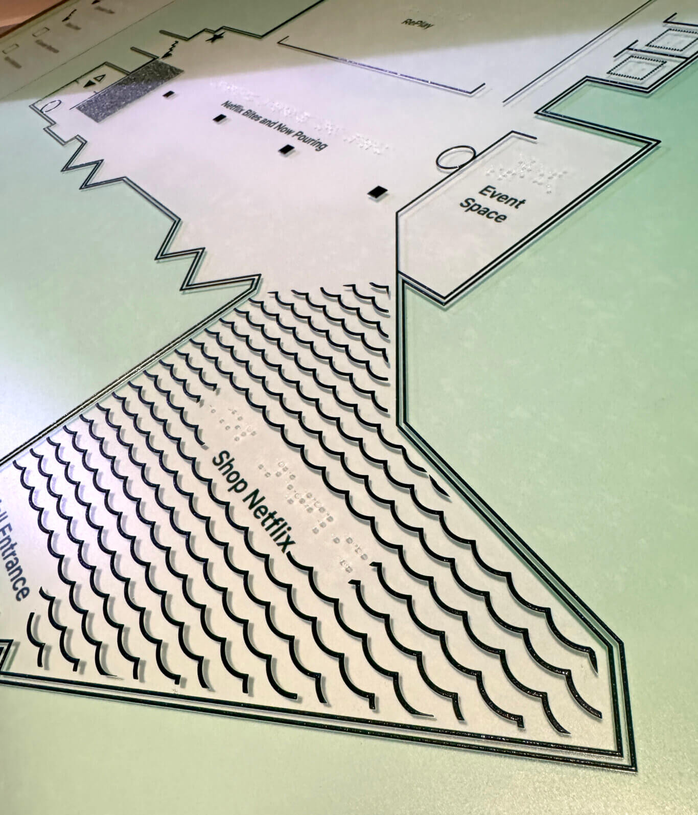
At the heart of the system is a series of large-format tactile wayfinding maps positioned at major entry points throughout the venue. These maps translate complex floor plans into clear tactile and high-contrast visual graphics using layered materials, varied textures, large-print text, and Braille labeling. Walls, thresholds, vertical circulation, and landmarks are differentiated through a consistent tactile vocabulary, allowing visitors to construct a mental map of the space through touch. Custom tactile iconography identifies amenities, experiential zones, dining, retail, and thematic areas, while a visual and tactile legend supports independent interpretation without staff assistance.
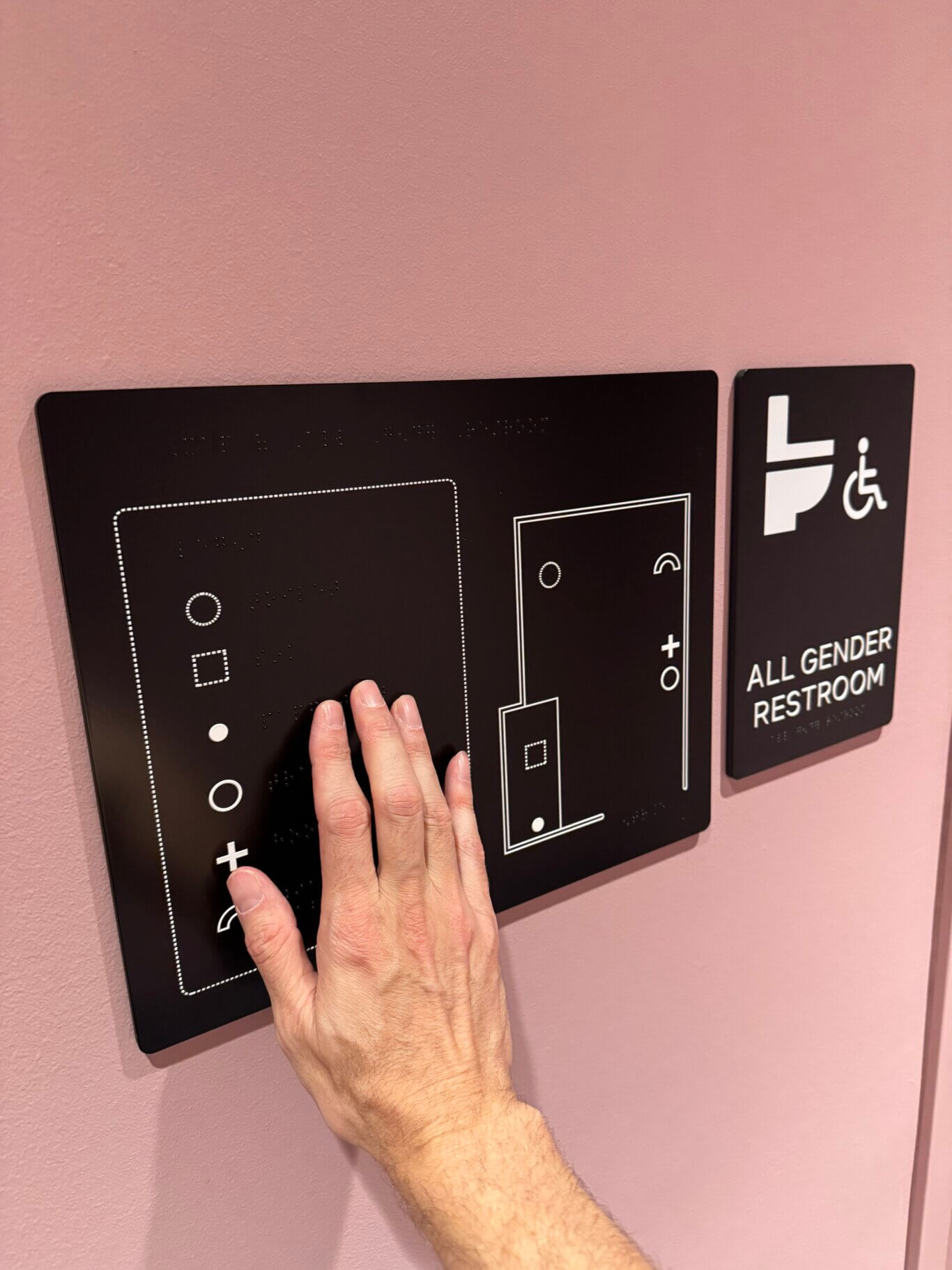
PAC also developed tactile maps for all restroom locations, providing spatial layouts of fixtures and amenities so that blind and low-vision visitors can independently locate, navigate, and use facilities with confidence. This extension of the system reinforces independence across the full visitor journey, not only within the main experiential areas.
The mounting condition materially shaped the design of each map. A tactile map mounted on a kiosk with knee clearance and a tilted surface can support a richer, more exploratory mode of use: visitors can approach closely, align their body with the map, use both hands comfortably, and spend time constructing a spatial understanding of the venue. That format can carry somewhat greater content density because the ergonomics support sustained tactile reading, comparison across zones, and repeated reference to the legend. A vertical wall-mounted map serves a different purpose. It must be more immediately legible, with lower cognitive load, stronger hierarchy, and less dense spatial information, because users are typically engaging it while standing, often in circulation space, and may not be able to maintain the same stable two-handed reading posture. PAC therefore treated the kiosk and wall-mounted conditions not as interchangeable display options, but as different wayfinding use cases: one optimized for deeper orientation and mental-map building, the other for faster confirmation, location awareness, and decision support at a glance or touch.
Tactile Floor Markers
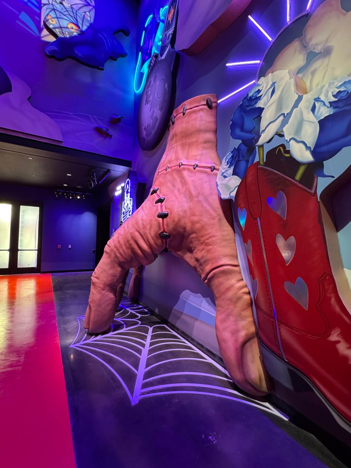
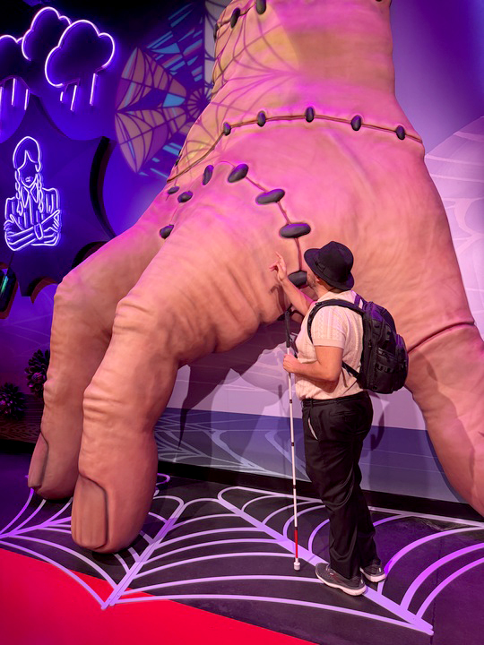
Customized tactile floor markers extend the wayfinding system into the environment itself. Designed to be discovered by white cane users, these raised elements signal key arrival points and serve as navigational anchors embedded in the scenographic design.
Beneath the sculptural installation of Thing from the series Wednesday, a raised spiderweb-shaped floor marker indicates arrival within a major experiential zone. In the Squid Game-inspired “Trapped in a Game” zone, floor markers composed of circles, squares, and triangles link directly to the iconography of the IP. These markers do not interrupt the environment. They become part of it, integrating spatial clarity with immersive storytelling.
Audio Navigation
Complementing the tactile system, an audio-based navigation experience is delivered through Netflix’s handheld audio devices, providing spatial overviews, directional guidance, and atmospheric context that allow visitors to build a layered understanding of the space. The audio content is crafted to function as a parallel immersive narrative, not as a purely functional overlay on a visual experience.
In the Squid Game zone, the audio describes staircases that “intersect and rise at perplexing angles, but lead absolutely nowhere,” situating the visitor spatially while also drawing them into the world. In the Wednesday-inspired zone, narration guides visitors toward an oversized sculpture of Thing while articulating material qualities through guided tactile description: rubbery smoothness, raised stitched seams, and shallow knuckle grooves. Navigation and storytelling are inseparable.
This approach reflects PAC’s broader work in (https://pac.bz/services/audio-description/) and inclusive content delivery, where description is not treated as a mechanical substitute for sight, but as a designed interpretive experience with its own craft, structure, and audience value.
Concluding Thoughts
This first engagement with Netflix House focused on wayfinding and content delivery, but the opportunity it represents is considerably larger. Wayfinding in immersive entertainment environments carries real social stakes. Without independent navigation, disabled visitors often rely on companions or staff, limiting autonomy and shaping how they experience a space. By embedding tactile and auditory navigation into the core design of Netflix House, this project advances equitable participation and enables blind and low-vision visitors to explore, discover, and belong on their own terms.
Immersive, themed environments are among the most promising contexts for inclusive experiential design precisely because their multisensory ambitions and accessibility goals point in the same direction. At their best, these spaces already ask visitors to listen, touch, move, notice, and inhabit a world through more than one channel. PAC’s work with Netflix House demonstrates how access can deepen that premise rather than constrain it.
PAC looks forward to continuing to build on this collaboration with the Netflix House team, expanding inclusive design across all facets of what these venues offer.