
Brand Guidelines Evaluation
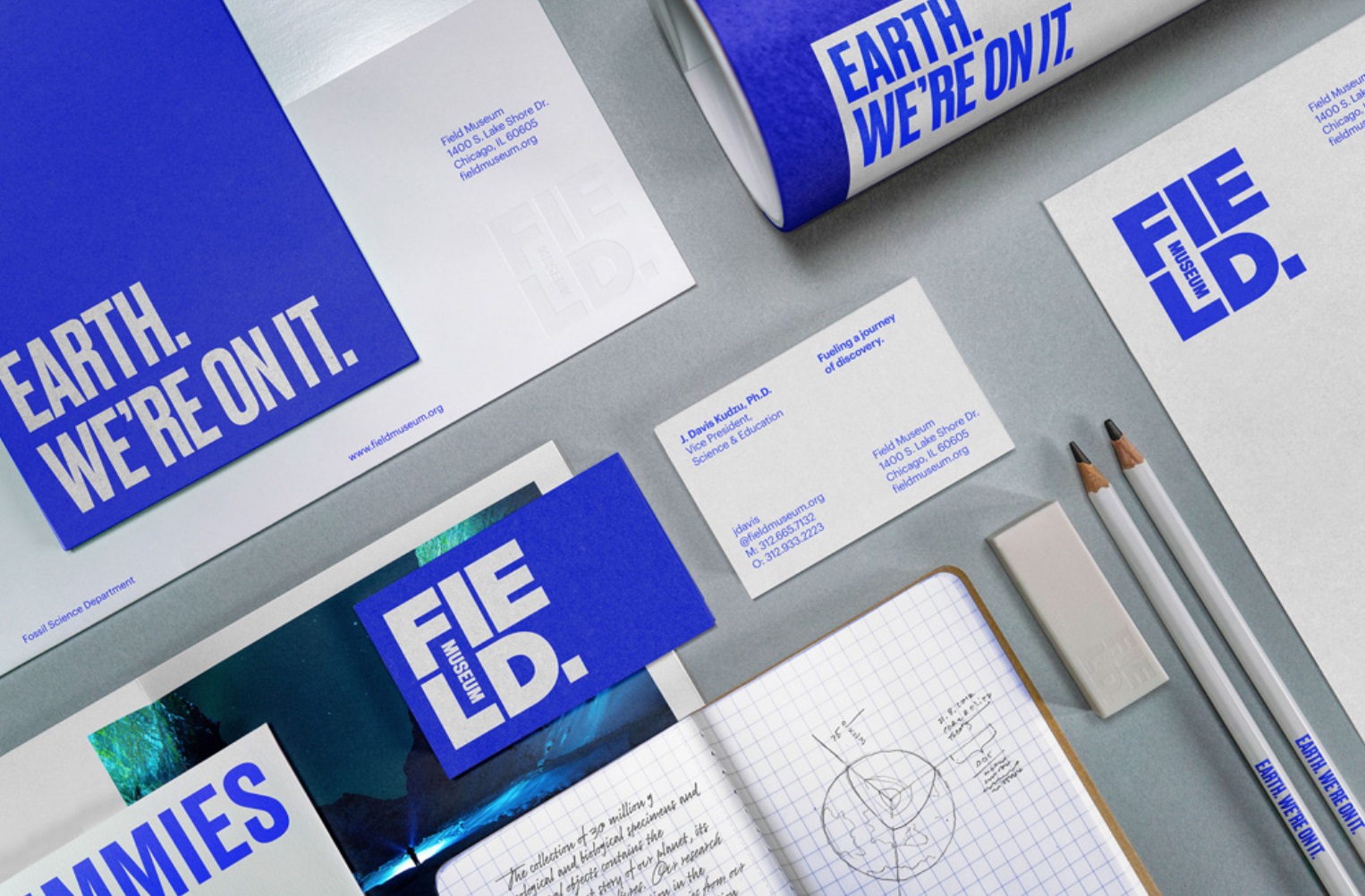
PAC helped the Field Museum and Leo Burnett evaluate the museum’s new brand style guide for inclusive design, recommending color-contrast adjustments and accessibility specifications that expanded the guidelines for readable, usable, and brand-aligned print and digital materials.
Media
Project Description
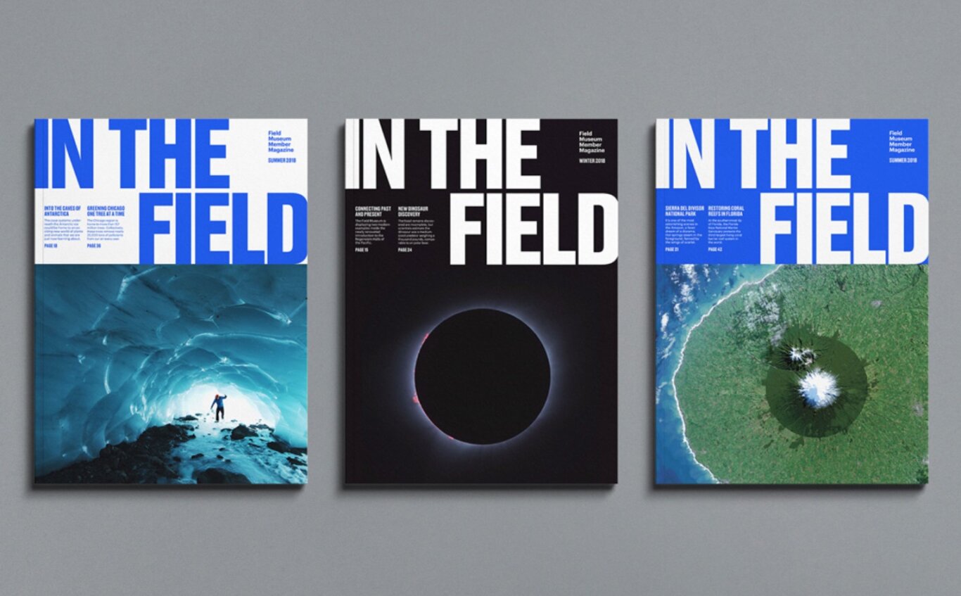
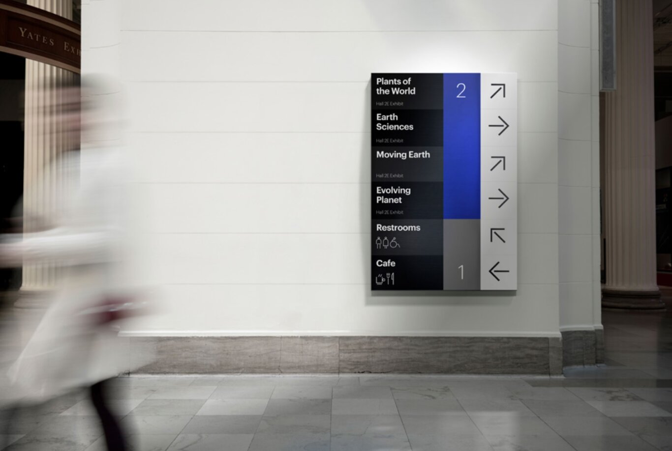
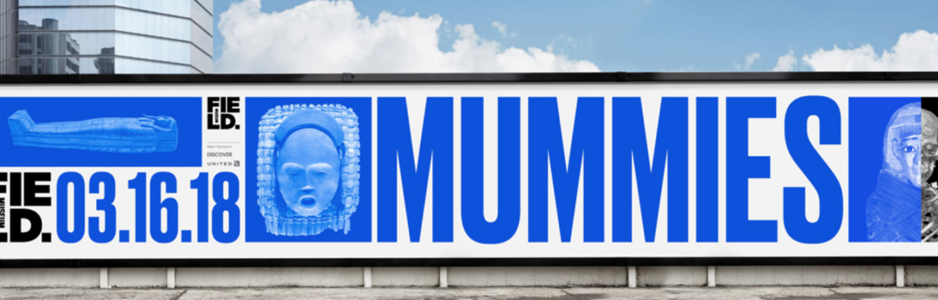
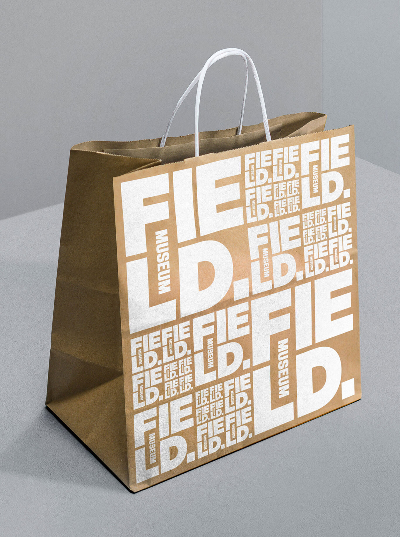
When the Field Museum launched its new visual brand identity, it engaged PAC to review the brand style guide through the lens of inclusive design. The goal was to ensure that the museum’s new visual system could retain its intended aesthetic while also supporting legibility, usability, and accessibility across print and digital applications.
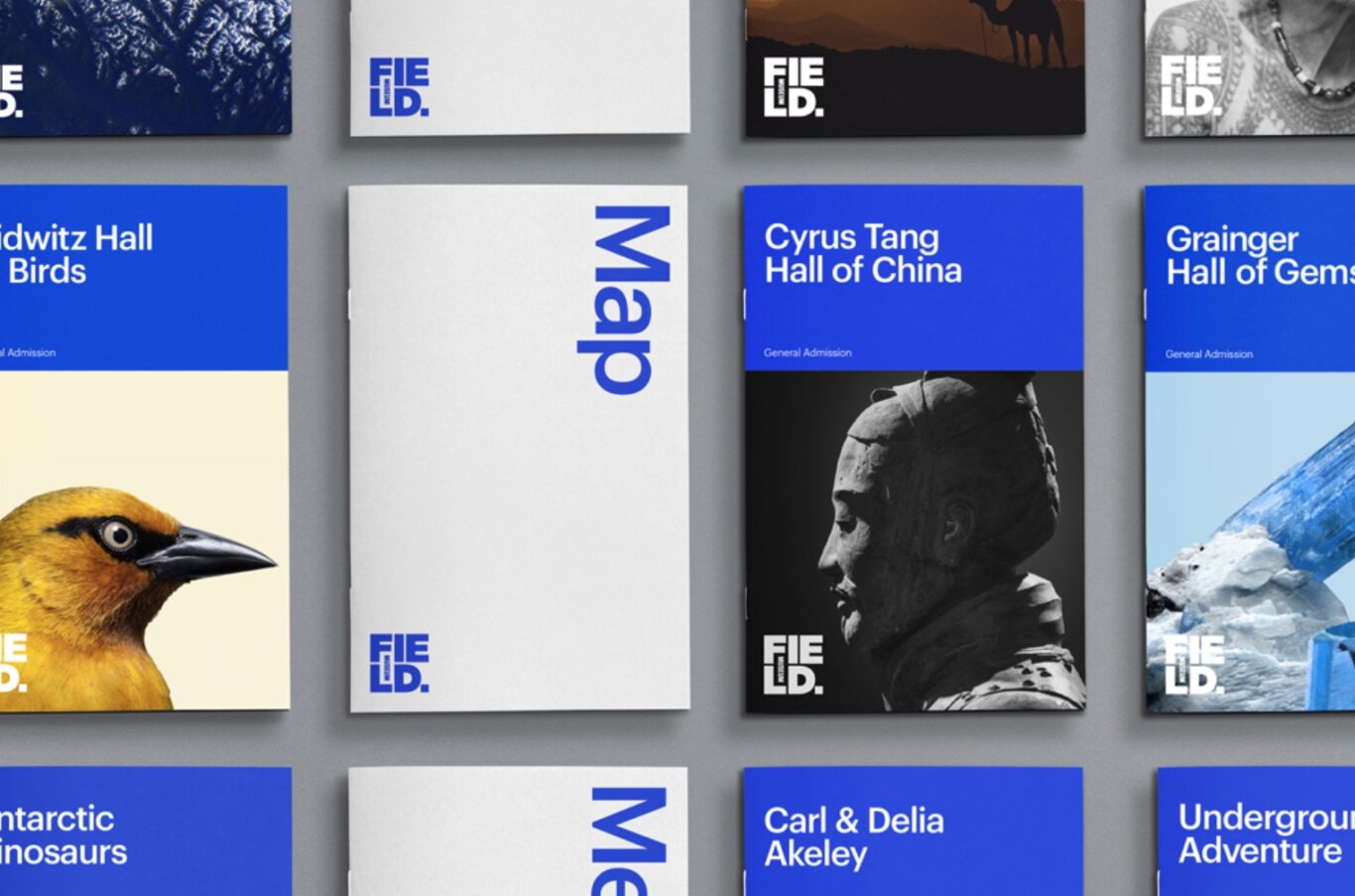
PAC worked with Leo Burnett, the museum’s agency, to evaluate the proposed color system and identify where adjustments were needed to improve contrast. This included clarifying which colors could be used together, which combinations should be avoided, and how the brand palette could be applied more accessibly across different types of materials.
Based on PAC’s recommendations, the Field Museum team expanded the style guide to include additional accessibility specifications for print applications. These additions helped ensure that future design work could embody the museum’s refreshed visual identity while giving staff, vendors, and design partners clearer guidance for producing materials that are readable, inclusive, and aligned with the brand.