
Projects: Field Museum

Brand Guidelines Evaluation
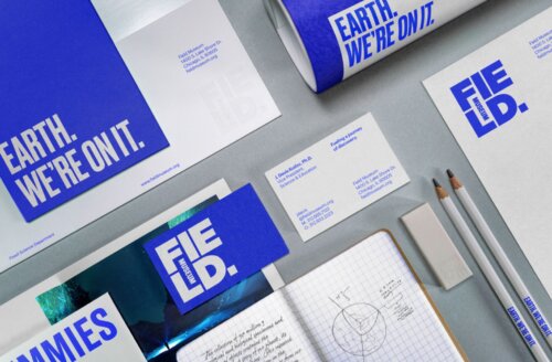
A neatly arranged set of Field Museum brand materials on a gray surface. The design uses a strong cobalt-blue and white color palette with bold, all caps, condensed typography. Visible items include a large folder or brochure reading "EARTH. WE'RE ON IT.", a letterhead sheet, a rolled poster, business cards, an envelope or booklet with the Field Museum logo, two white pencils printed with the campaign slogan, and an open grid notebook containing handwritten notes and a small earth-like sketch.
Field Museum

PAC helped the Field Museum and Leo Burnett evaluate the museum’s new brand style guide for inclusive design, recommending color-contrast adjustments and accessibility specifications that expanded the guidelines for readable, usable, and brand-aligned print and digital materials.

Website Accessibility for FieldMuseum.org
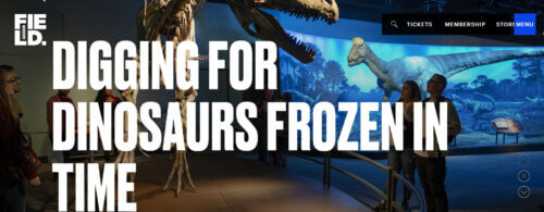
A wide screenshot of The Field Museum's website. In the background, visitors stand inside a dimly lit dinosaur exhibit with large dinosaur skeletons and a blue prehistoric mural. Over the scene, oversized bold white headline text says in all caps, "DIGGING FOR DINOSAURS FROZEN IN TIME." The Field Museum logo appears in the upper left. A black navigation bar in the upper right includes a search icon and links for "TICKETS," "MEMBERSHIP," "STORE," and a blue "MENU" button. On the right side of the hero image are vertical circular controls, likely for a carousel.
Field Museum

PAC helped the Field Museum integrate accessibility into FieldMuseum.org from brand guidelines through design and implementation, advising on legibility, contrast, image-based design patterns, visitor accessibility content, and WCAG A/AA auditing to support a visually expressive, usable, and inclusive website.

Footer

Prime Access Consulting