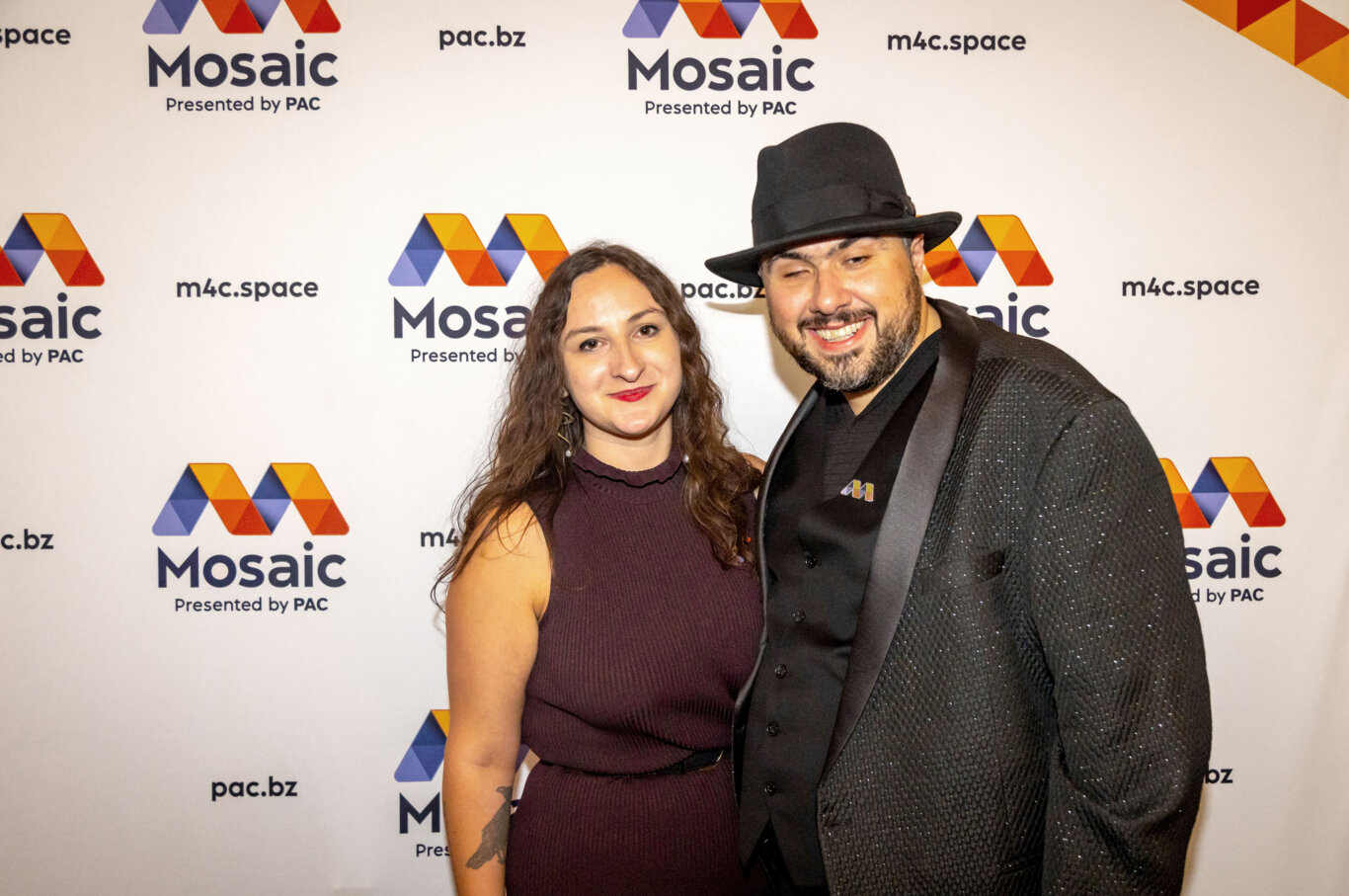
Mosaic Convening Branding
PAC developed Mosaic’s award-winning multimodal brand identity for its inaugural convening, creating interconnected visual, tactile, motion, sound, print, and live event applications that centered inclusion structurally.
Project Description
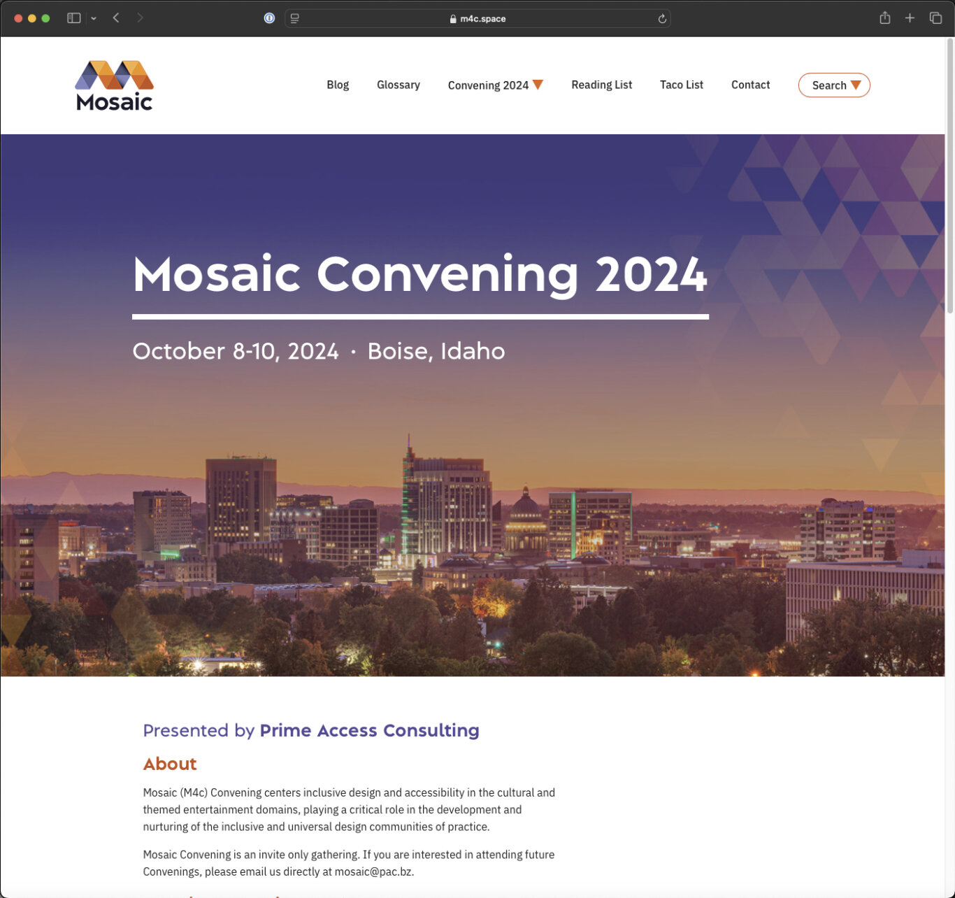
Mosaic, also known as M4c, is an inclusive design and accessibility community of practice created to center inclusion within cultural, entertainment, and location-based experience design. Its inaugural convening was a single-track, invite-only, two-day gathering that brought together leaders committed to shaping the future of access and inclusion across sectors.
The convening included multidisciplinary practitioners working across capital projects, themed entertainment, digital experiences, capacity building, event production, policy, administration, community engagement, patron services, and guest experience. Recognition sessions highlighted noteworthy inclusive design projects, while dialogue sessions explored emerging frameworks and practices. Across every presentation, discussion, and interaction, inclusion was treated not as a parallel concern, but as the central organizing principle.
PAC developed a brand identity for Mosaic that would do more than visually signal accessibility. The identity needed to embody inclusion structurally. Because the audience included designers, accessibility professionals, disabled community members, technologists, cultural leaders, and experience producers, multimodal access was a foundational design requirement from the beginning.
The brand needed to function cohesively across digital platforms, environmental graphics, tactile components, motion, sound, print, and live event applications. Visual, tactile, and aural expressions needed to reinforce one another so the identity could be perceived and understood across modalities.
Design Approach
The design process began with a clear principle: the brand would be multimodal from inception rather than adapted after the fact. This required rethinking a traditional identity workflow. Instead of beginning with a visual mark and then extending it into other formats, PAC developed parallel tracks for sight, sound, touch, motion, and physical application from the earliest concept phase.
Early exploration focused on identifying a structural idea that could translate across modalities. Interconnected triangular geometry emerged as a flexible system capable of expressing aggregation, connection, and collective strength. PAC prototyped how this geometry could function across digital interfaces, environmental graphics, printed materials, and physical objects, while contrast testing assessed legibility under varied screen, print, and lighting conditions.
Motion studies explored how the triangular forms could unfold, sequence, and create rhythm over time. These experiments directly informed the audio treatment, ensuring that sound was developed as part of the identity system rather than added as a later accommodation. Timing, pacing, tonal structure, and syllabic rhythm were refined through iterative alignment between movement and sound.
Tactile prototyping examined how geometry, adjacency, color relationships, and tonal variation could be translated into physical form. PAC evaluated materials, edge conditions, surface patterns, density, scale, and manufacturing constraints to determine how the brand could be meaningfully perceived through touch.
Integrated testing with disabled participants across visual, auditory, and tactile outputs helped ensure that the identity remained conceptually and perceptually aligned across modalities. The result was a cohesive multimodal brand system rather than a visual identity with accessibility features appended to it.
Solution
The final identity system was deployed across digital, environmental, physical, motion, and live event contexts.
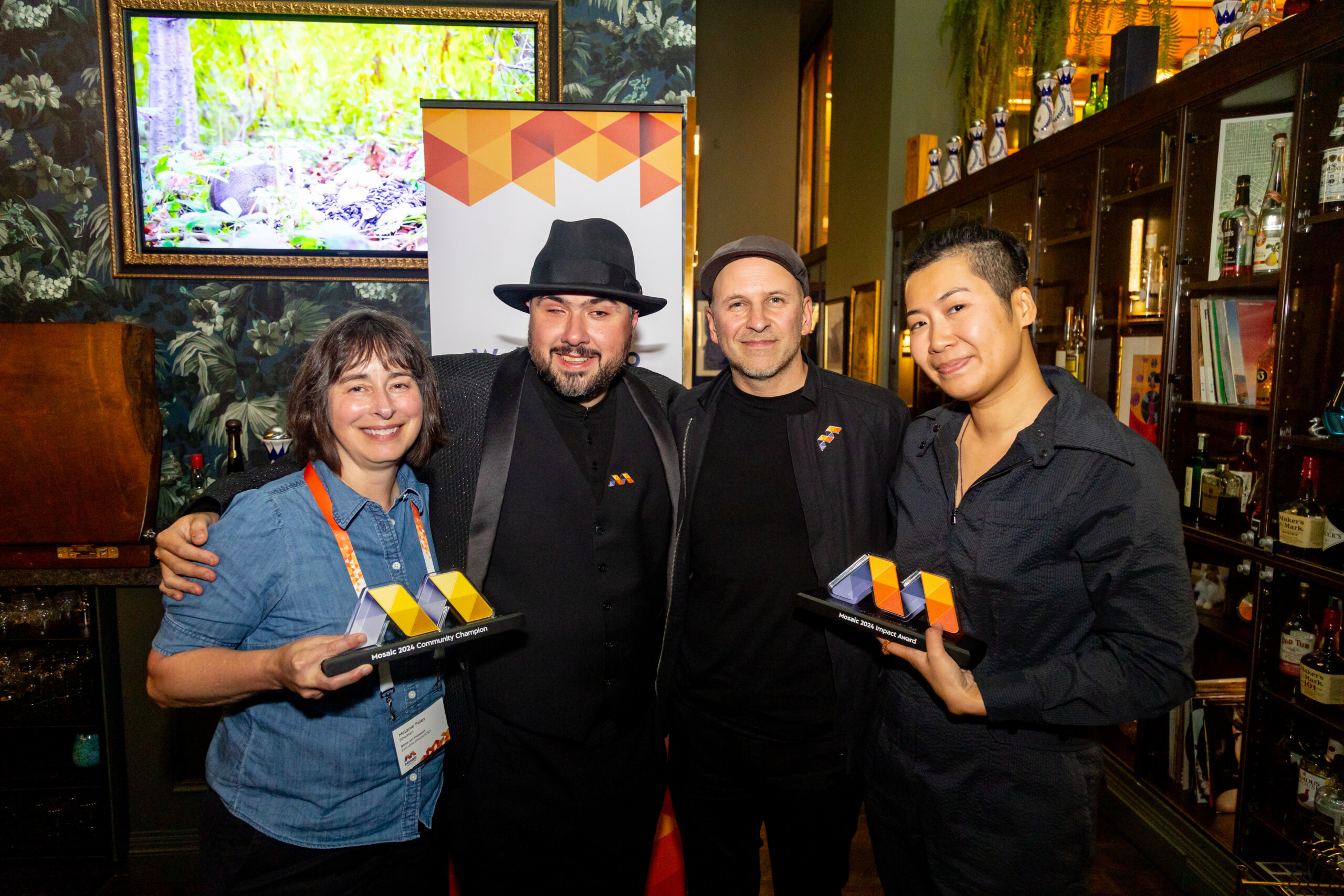
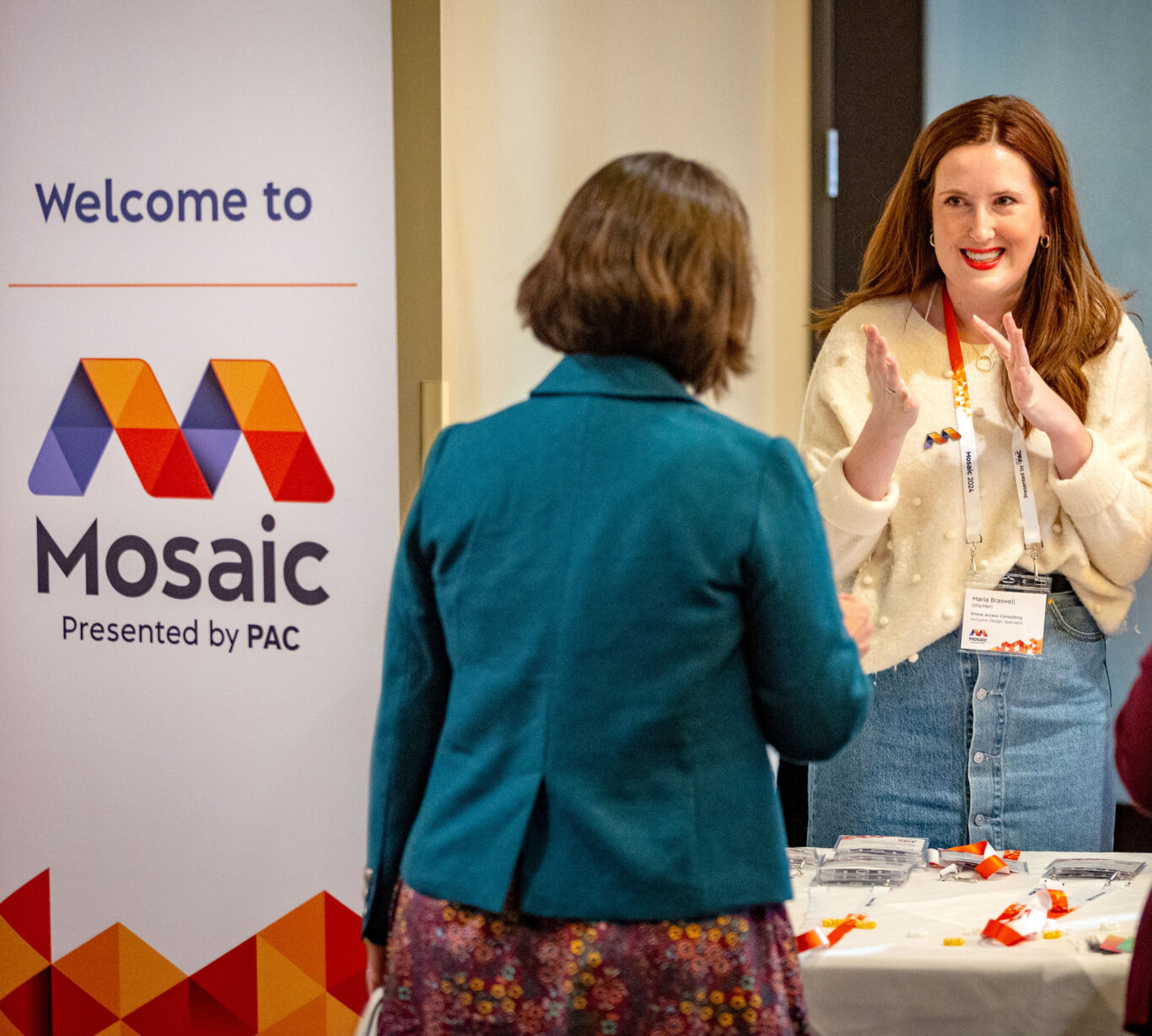
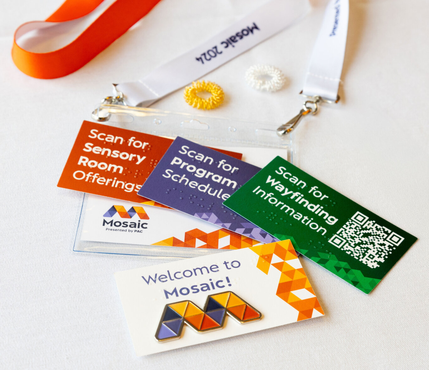
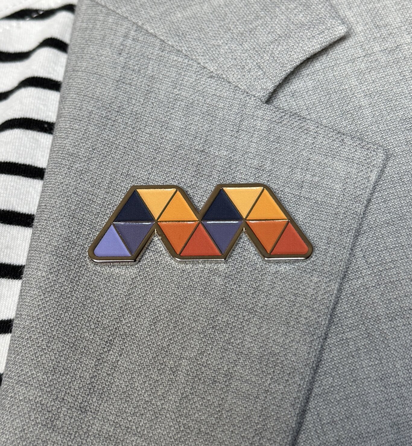
Visually, the interconnected triangular “M” served as a scalable geometric system for mobile icons, website elements, presentation materials, environmental graphics, and printed collateral. A high-contrast palette of orange, purple, black, and white provided clarity across screens and printed materials while retaining warmth, energy, and visual distinction.
In motion, linked triangles unfolded into a wide “M,” creating a repeatable animated sequence for digital media and presentations. The animation was paired with a custom earcon: a sustained stringed note, a brassy rumble as the triangles unfolded, the sound of shuffling papers, and the notes of a G-major chord on piano synchronized to the syllables in “Mo-sa-ic.” Together, the motion and sound created a recognizable multimodal brand signature.
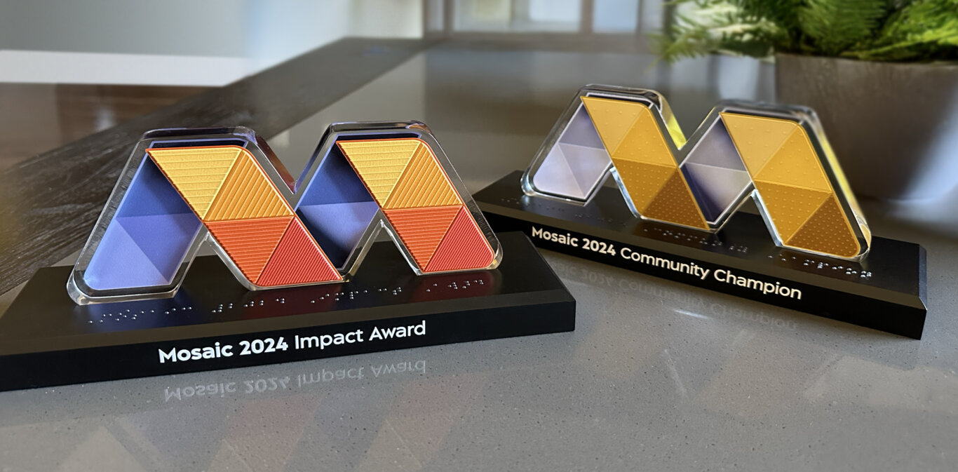
Tactile expression extended the identity into physical objects. Enamel pins were manufactured so each triangular segment could be distinguished by touch. The inaugural conference awards translated color and gradient relationships into tactile form through recessed edges, diagonal hatch patterns, and raised dot densities, allowing tonal variation to be understood non-visually. Braille labeling was integrated alongside printed text.
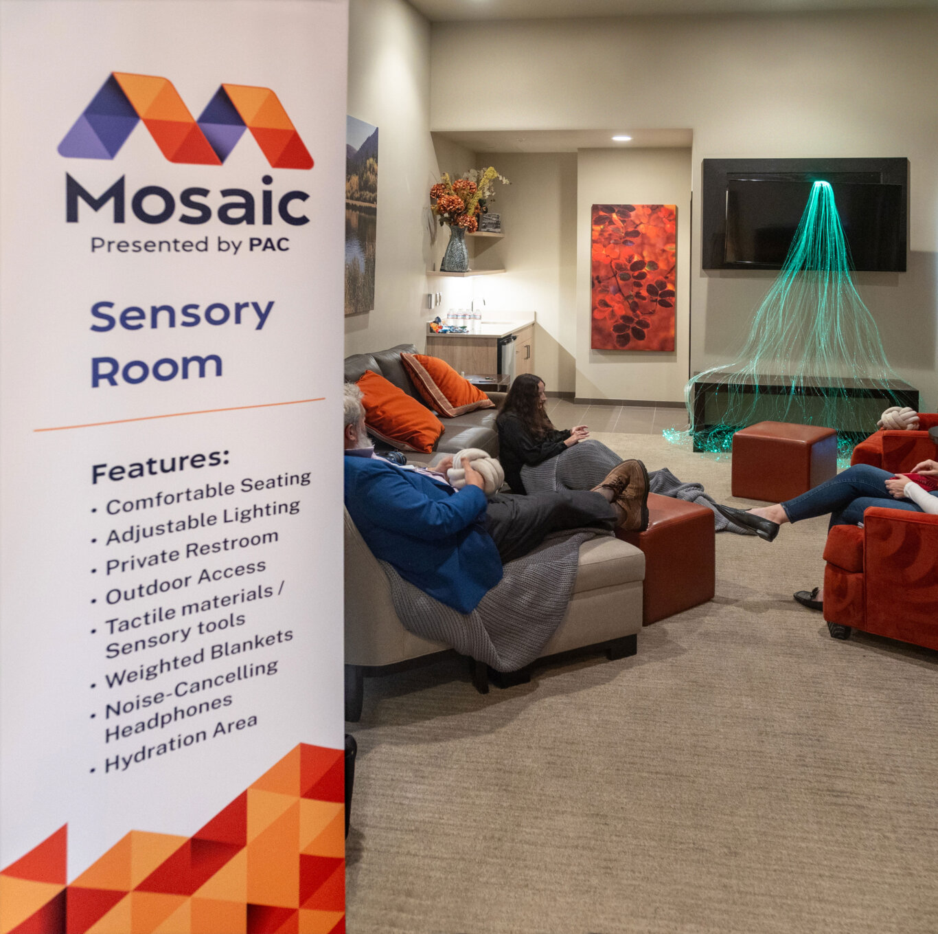
The identity system also complemented the broader convening experience, which included high-contrast graphics, tactile maps, accessible web architecture, Braille menus, captioning, live audio description, ASL interpretation, a sensory room, and multimodal evening venue affordances.
The result was a brand that functioned not simply as a graphic identity, but as an inclusive experience system across multiple modalities.
Recognition
The multimodal branding design for Mosaic received an Honorable Mention from the International Design Awards.