
Transforming Grief Loss and Togetherness in COVID-19 Exhibition
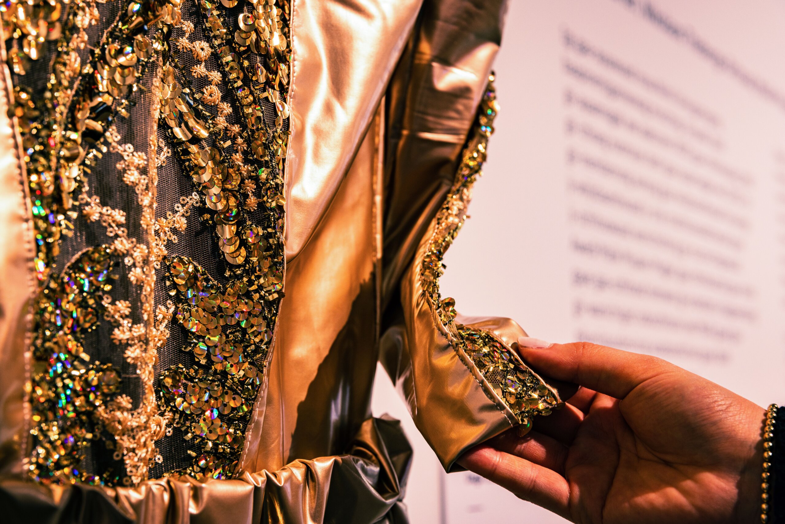
PAC collaborated with the City of Toronto and curators Armando Perla and Raven Spiratos to design, produce, and launch Transforming Grief: Loss and Togetherness in COVID-19, a community-developed, co-curated, multimodal, tri-lingual exhibition integrating inclusive physical and digital access.
Media
![A close-up from behind of a person with long straight black highlighted hair wearing large black headphones and touching one ear cup with their medium skin tone hand and light pink nail polish. In front of them is a screen or monitor displaying a blurred video of a performer in a shiny, gold, embellished costume, with a caption visible near the bottom reading, "[beat, beat, beat], go."](https://pac.bz/wp-content/uploads/2026/05/A-long-haired-person-wearing-over-ear-headphones-watches-a-subtitled-video-1-1366x904.jpg)
Project Description
In the spring of 2020, the COVID-19 pandemic swept across Tkaronto/Toronto. This immediate transformation caused many to be left with a real sense of unease, forcing us all to change how we went about our daily lives and interact with each other. Some were pushed outside, onto the front lines. Others lost loved ones. Most were lonely, and many grieved.
Two curators, Armando Perla and Raven Spiratos, working for the City of Toronto, endeavoured to collect and share these stories. On an incredibly tight budget, in just 8-months, Prime Access Consulting (PAC) and the curators collaborated to design, produce, and launch a community-developed, co-curated, mixed, and transmedia exhibition that fully embraced PAC’s Inclusive Design methodology. Transforming Grief: Loss and Togetherness in COVID-19 redefined what a museum exhibition could do, and who it could be for.
The project was driven by a need to center historically marginalized communities, move beyond traditional, visually dominant exhibition formats, and create a space where visitors could process loss, not just observe it. As the designers and producers, PAC ensured the exhibition did not replicate the same barriers it aimed to critique by embedding inclusive design across the entire experience, not as compliance, but as a core design strategy. The result was a fully multimodal, tri-lingual, co-created exhibition that allowed visitors to engage through touch, sound, language, and digital systems, all within a single, shared experience.
PAC designed and delivered an exhibition that integrated physical and digital environments into a single, cohesive system. The work spanned content, media, environment, and digital infrastructure, ensuring that no part of the experience operated in isolation. Instead of offering separate accessible versions, the exhibition created one shared experience with many ways in. Visitors were invited to engage in whatever way felt most natural to them, whether visually, tactiley, auditorily, or digitally, without being routed elsewhere.
Integrated System of Physical and Digital Components
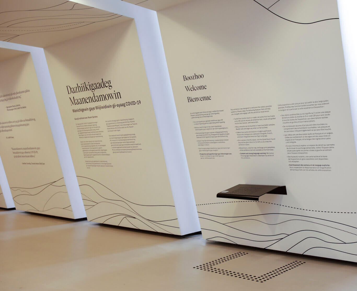
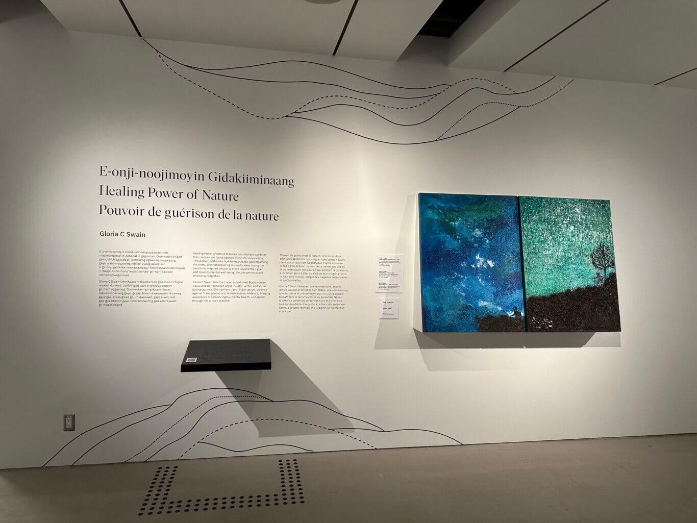
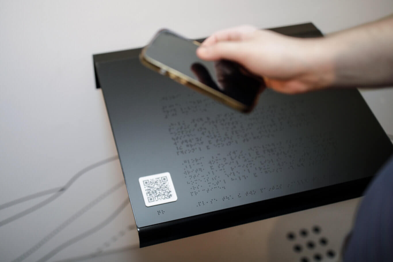
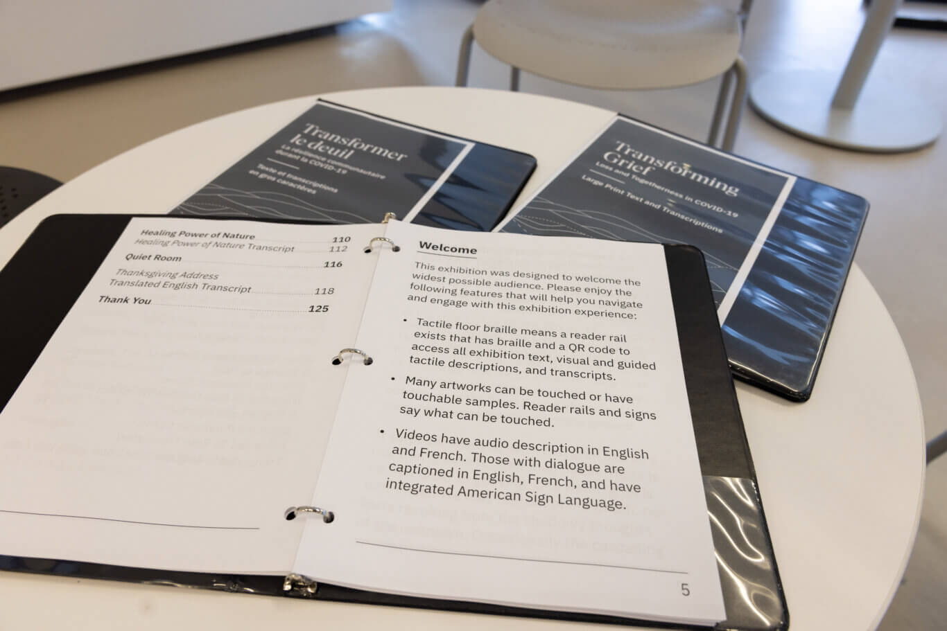
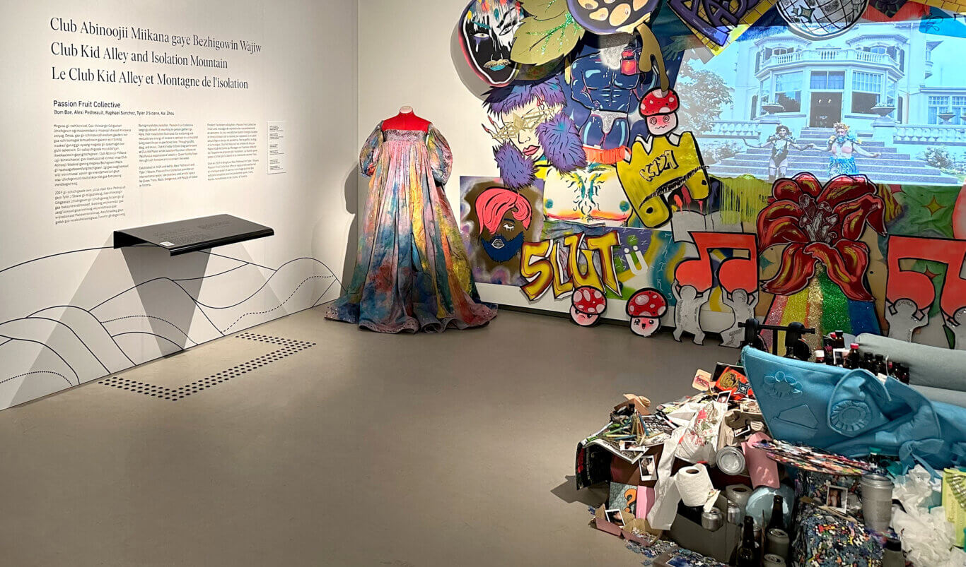
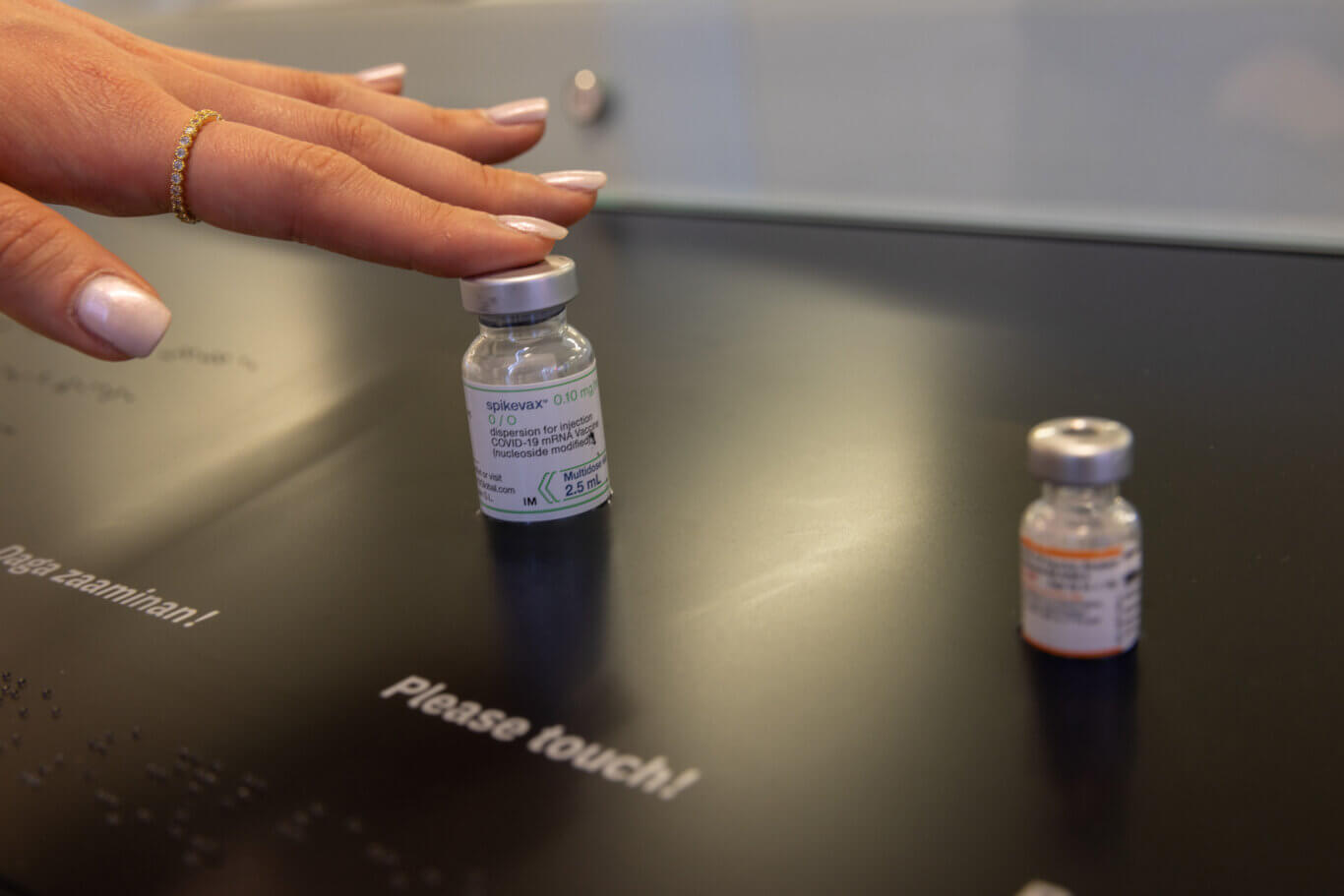
A tactile vocabulary was created and implemented in the built environment to facilitate multimodal wayfinding, consisting of tactile floor markers, reader rails, edge detection, and tactile QR codes. These QR codes led to an accessible website that was designed, produced, and hosted by PAC. This website contained all linear media with signed interpretation, captions, audio description, and enhanced transcripts in three languages: Anishinaabemowin, English, and French. All exhibition text was available in Braille, large print binders, mobile access to facilitate zoom, color, and contrast swapping, text-to-speech, and location awareness regarding content and the installations.
The design of the content was also carefully considered: reading level, inferred dwell time, and presentation. The graphic design was deliberately crafted to meet inclusive design standards in situ, online, and in collateral, including size-to-distance considerations, viewing angles, visual hierarchies, color, and contrast ratios.
Reworking Power, Place, and Participation
PAC supported the curatorial team to structure deep community involvement. The exhibition was not just about marginalized communities, it was shaped with them. Co-creation, trust-building, and accessible art commissioning ensured that representation extended beyond content into authorship.
A critical move was the transformation of Fort York itself. A colonial military site became part of the story, military artifacts were removed, the weapons vault was reclaimed and redesigned as a sensory space by guest Indigenous curator Heather George, and the environment shifted from one of conflict to one of reflection and care. This was not just an exhibition placed in a space, it was a reworking of the space’s meaning.
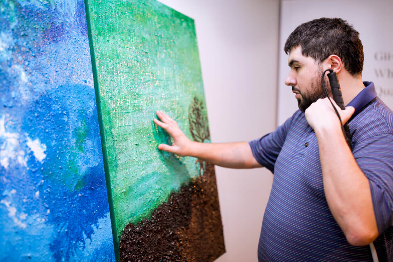
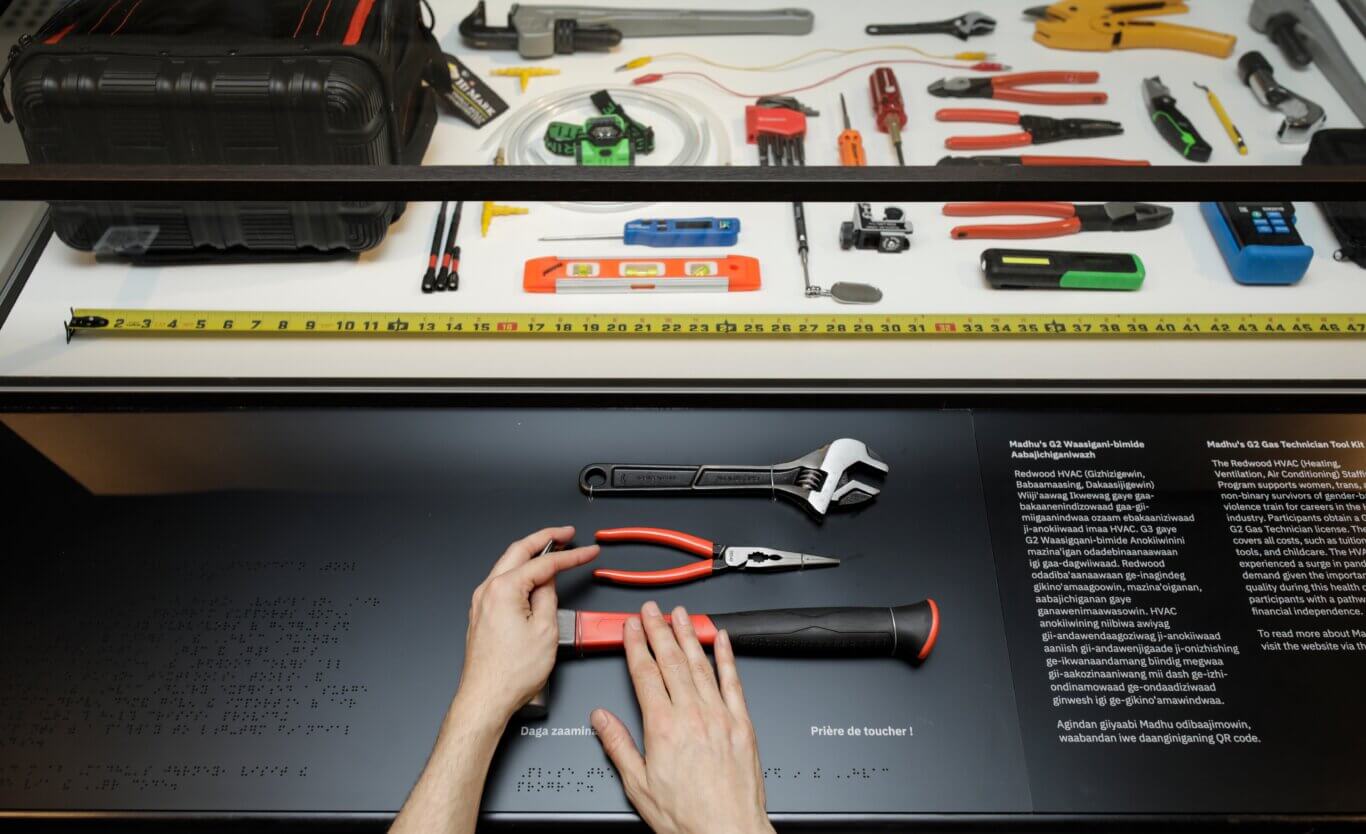
PAC and the curators worked collaboratively with the commissioned artists to bring them along with the mission of accessible content. This meant all artifacts and objects contained visual descriptions that carefully considered self-identification and artistic intent, direct tactile engagement with artworks when possible, and offering touch alternatives when not, guided tactile descriptions, sound, and audio description.
As PAC has long demonstrated through our design ethos, the project stood as proof: inclusion, when treated as a design driver, produces better, more meaningful experiences for everyone.
Transforming Grief showed what happens when inclusion is treated as a core design condition and demonstrated that comprehensive inclusion is achievable, even under a tight timeline and budget. By integrating access across content, space, and systems, PAC helped create an exhibition that was not only more accessible but more human, more representative, and more impactful. It did not just tell stories of loss and togetherness. It made space for people to experience both on their own terms.
Recognition
Transforming Grief: Loss & Togetherness in COVID-19 received several industry recognitions, including a Bronze award from the International Design Awards in the Cultural Interior Design/Installation category, an Honorable Mention from the Built Design Awards for Interior Design/Exhibition/Gallery, and finalist recognition from the Society for Experiential Graphic Design in the Exhibition/Museums category. The project was also featured in an academic article exploring themes of grief, memory, and collective experience during the COVID-19 pandemic.